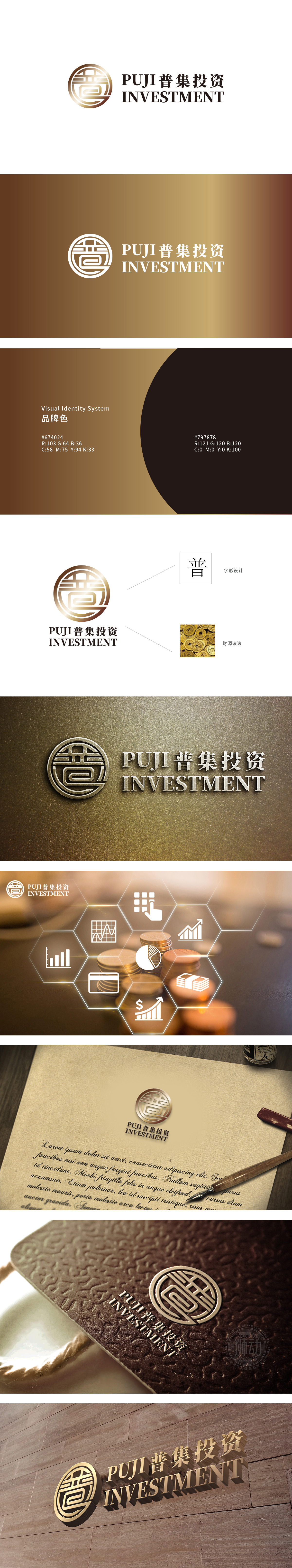
狮动设计以金色渐变圆形为基底,外层环绕双层“回纹”边框,既象征财富的循环与积累,又传递出“圆满、稳固”的视觉感受,契合投资行业对“可持续增长”和“风险控制”的核心诉求。中心“普”字的抽象化演绎,通过几何化切割形成对称结构:,隐喻“覆盖广泛、普惠共享”金色渐变:主色调采用从浅金到深棕的渐变,既有黄金的财富象征,深棕调的加入增添沉稳气质,传递“专业、可靠”的品牌形象。整体通过圆形、回纹、金色等元素传递“财富、安全、循环”,符合投资用户对“稳健增值”的心理预期。
Lion design is based on a golden gradient circle, and the outer layer is surrounded by a double-layer "palindrome" frame, which not only symbolizes the circulation and accumulation of wealth, but also conveys a "complete and stable" visual feeling, which is in line with the core demands of the investment industry for "sustainable growth" and "risk control". The abstract deduction of the central word "Pu" forms a symmetrical structure through geometric cutting, which is a metaphor of "wide coverage and universal sharing"Gradual change of gold.


扫码或拨打添加客服微信


