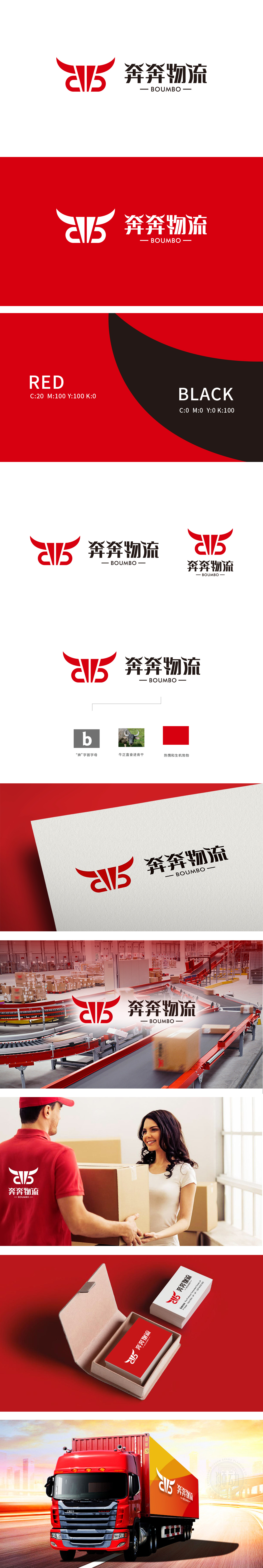
狮动设计以牛的头部轮廓为核心意象,红色牛角呈对称上扬的“V”形,尖锐且富有张力,又通过倾斜角度传递出向前冲击的动感,暗合“奔奔”品牌名中“奔跑、高效”的内涵。牛作为传统意象中“勤劳、坚韧、力量”的象征,与物流行业“承载重物、高效运输”的核心功能高度契合,凸显现代物流的迅捷与可靠。标志多维度构建了品牌“值得信赖的伙伴”形象,拉近与用户的心理距离。
Lion design takes the outline of the cow's head as the core image, and the red horn is symmetrically rising in the shape of "V", which is sharp and full of tension. It also conveys the sense of forward impact through the inclined angle, which coincides with the connotation of "running and efficiency" in the brand name of "Ben Ben". Cattle, as a symbol of "diligence, tenacity and strength" in the traditional image, is highly compatible with the core function of "carrying heavy objects and efficient transportation" in the logistics industry.


扫码或拨打添加客服微信


