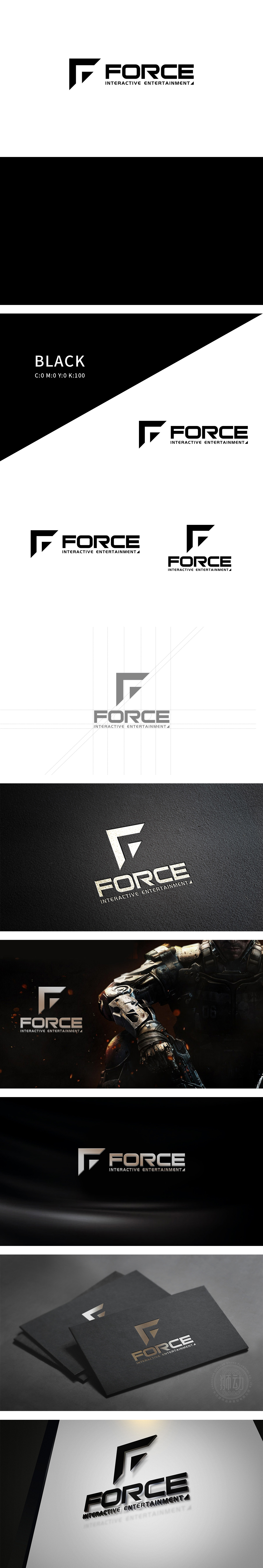
狮动设计将“F”字母经过抽象变形,整体呈现锐利的几何切割感——倾斜的斜边、三角缺口和硬朗的直线条,既保留了字母识别度,又像一把锋芒毕露的“武器”或“引擎部件”,直接传递出游戏行业常见的“力量、科技、竞技感”。黑白对比也传递出“专业、纯粹、聚焦内容”的品牌调性,整体用极简的元素传递了“力量、专业、游戏基因”三大核心信息,图形与文字的逻辑高度统一,既有视觉记忆点,又暗藏行业属性的精准表达。
Lion Design has abstractly deformed the letter "F", presenting a sharp sense of geometric cutting as a whole-inclined hypotenuse, triangular notch and tough straight line, which not only retains the letter recognition, but also directly conveys the common "strength, technology and competitive sense" in the game industry like a sharp-edged "weapon" or "engine component". The contrast between black and white also conveys the brand tonality of "professionalism.


扫码或拨打添加客服微信


