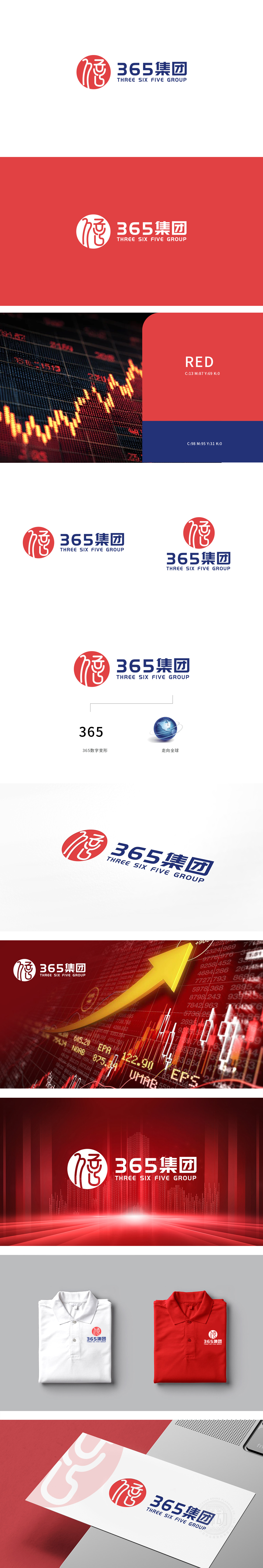
狮动设计以线条的走势既像“3”的弧度,又隐含“6”的转折,最终以“5”的收尾形成闭环,这种“一形多义”的设计,既直接点出了“365”的品牌名称,又传递了“全年无休、动态发展”的企业属性,用最少的元素实现了“名称识别+价值传递”的双重功能。LOGO中的“365”变形图形,传递了“持续发展、动态成长”的企业价值,而红蓝配色的“活力+稳重”组合,又强化了“既有成长潜力,又有风险控制能力”的投资者认知,完美平衡了“创新”与“靠谱”的品牌形象。
Lion design takes the trend of lines as the arc of "3" and implies the turning point of "6", and finally forms a closed loop with the ending of "5". This "ambiguous" design not only directly points out the brand name of "365", but also conveys the enterprise attribute of "year-round and dynamic development", and realizes the name recognition with the least elements. The "365" deformed figure in LOGO conveys the enterprise value of "sustainable development and dynamic growth".


扫码或拨打添加客服微信


