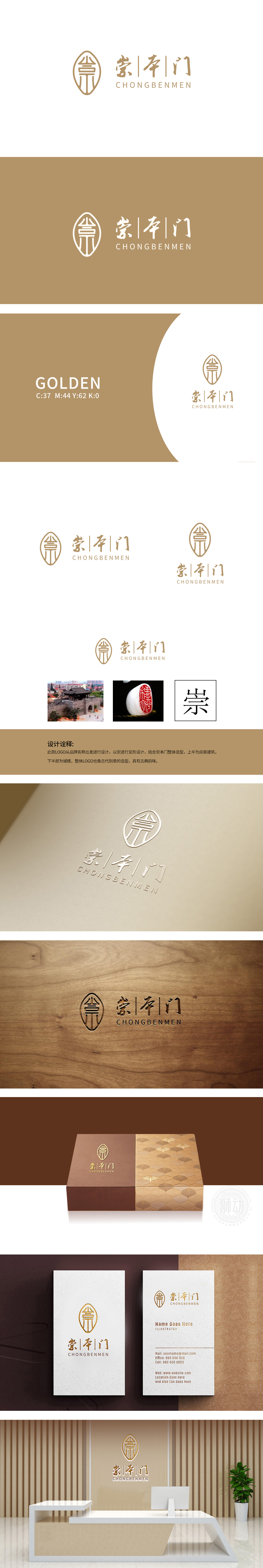
狮动设计以‘崇’进行变形,结合崇本门整体造型”,“崇”字作为LOGO核心,通过书法笔触的变形,传递“尊崇、重视”的态度,对应保健品“重视健康本质”的品牌理念;整体LOGO的“古代印章”形态,在传统语境中代表“权威、认证”,恰好满足保健品消费者对“安全、靠谱”的核心诉求。通过“品牌名→造型→情感”的层层递进,将“崇本门”的品牌故事(比如“源自传统、守护健康”)用视觉语言“说”了出来。
Lion design is transformed with "Chong", combined with the overall modeling of Chongben Gate, and the word "Chong" is the core of LOGO, which conveys the attitude of "respecting and attaching importance" through the deformation of calligraphy strokes, corresponding to the brand concept of "attaching importance to health essence" of health care products; The "ancient seal" form of the overall LOGO represents "authority and authentication" in the traditional context, which just meets the core demands of health care consumers for "safety and reliability".


扫码或拨打添加客服微信


