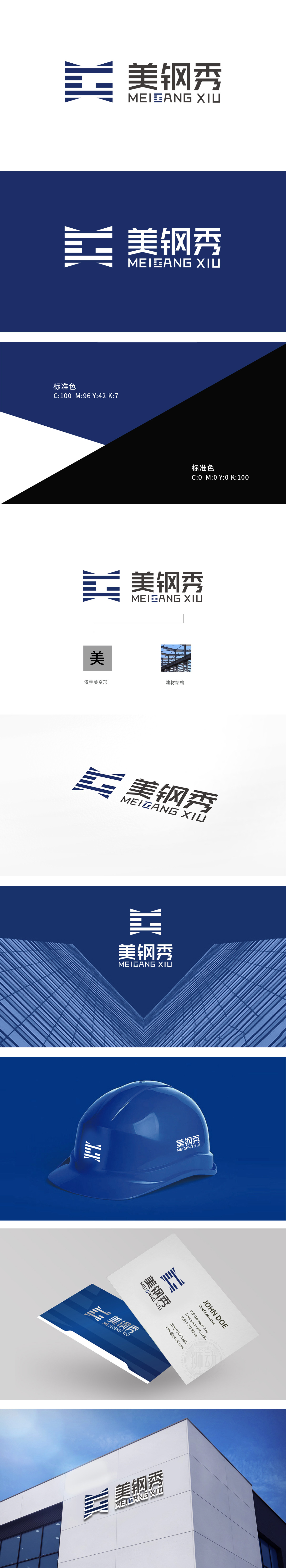
狮动设计以汉字“美”为原型,将传统“美”字简化,形成类似钢材纹理或建筑结构梁的视觉符号。中文“美钢秀”采用粗体方正字体(,强调建材行业的稳重与专业;用汉字的文化底蕴,赋予品牌“美感”的情感联想,让“美钢秀”不仅是“卖钢材的”,更是“懂美的建材品牌”。传递这是一个专注于‘钢结构建材’,且注重‘美感’的品牌”的认知。
Lion design takes the Chinese character "beauty" as the prototype, which simplifies the traditional word "beauty" and forms a visual symbol similar to steel texture or building structural beam. The Chinese "Meigang Show" adopts bold square font (,emphasizing the stability and professionalism of the building materials industry; With the cultural connotation of Chinese characters, the brand is endowed with the emotional association of "aesthetic feeling".


扫码或拨打添加客服微信


