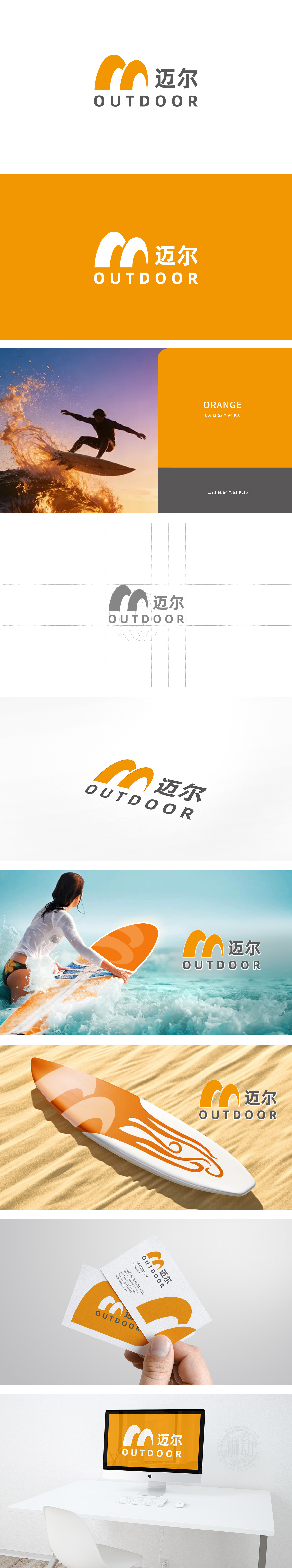
狮动设计以波浪曲线的负空间巧妙形成了“M”字形,将品牌名称与图形符号深度绑定,强化了品牌识别度;两组波浪的高低起伏与倾斜角度,模拟了波浪流动的瞬间状态,仿佛正在推动冲浪者前进,传递出“活力、动感、冒险”的体育精神,符合冲浪运动的“自由与激情”内核。用“橙灰”平衡“活力与专业”,整体LOGO既符合专业体育品牌的“功能性”要求,又具备年轻时尚的“传播性”。
Lion design skillfully forms an "M" shape with the negative space of wave curve, which deeply binds the brand name with graphic symbols and strengthens the brand recognition. The ups and downs and inclination angles of the two groups of waves simulate the instantaneous state of wave flow, which seems to push the surfer forward and convey the sportsmanship of "vitality, dynamism and adventure", which is in line with the core of "freedom and passion" of surfing.


扫码或拨打添加客服微信


