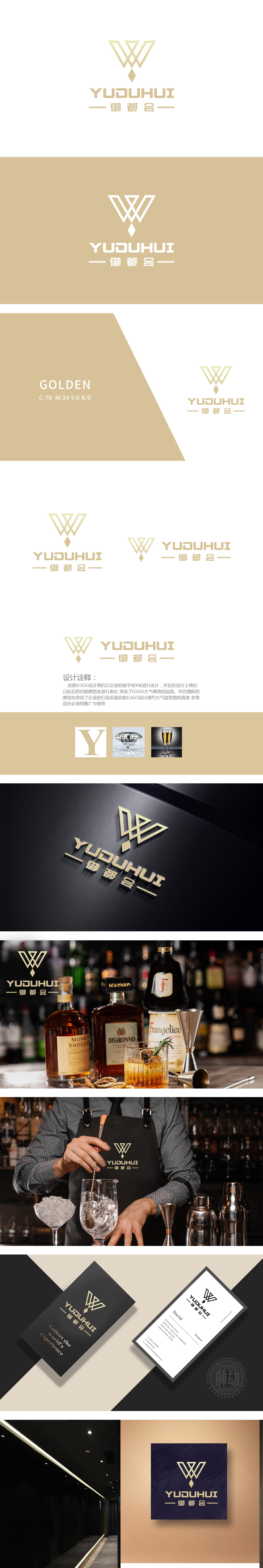
狮动设计以品牌首字母“Y”为核心,用钻石切割的质感重新塑造了它——棱角分明的线条、立体的切面,像一颗璀璨的钻石,瞬间把“御都会”这个名字里的“御”(尊贵)、“都”(繁华)的感觉拉满。传递了高端定位,让用户看到LOGO就联想到“品质、奢华、值得体验”。金色是“温暖、高级、有仪式感”的代表,刚好匹配会所“夜晚灯光下的暧昧、高端消费的质感、朋友聚会的愉悦”氛围。而且钻石切割的立体效果让金色不显得单调,反而有“流光溢彩”的感觉,像酒吧里的灯光、酒杯里的酒液,瞬间能调动起用户的情绪,用“符号化”传递品牌记忆。
Lion design takes the brand initials "Y" as the core, and reshapes it with the texture of diamond cutting —— angular lines and three-dimensional sections, like a bright diamond, instantly fill up the feelings of "Imperial" and "Capital" in the name "Imperial City". Delivered high-end positioning, allowing users to see the LOGO and associate it with "quality, luxury and worth experiencing". Gold is the representative of "warm, advanced and ceremonial", which just matches the atmosphere of the club "ambiguity under the night lights, the texture of high-end consumption and the pleasure of friends gathering".


扫码或拨打添加客服微信


