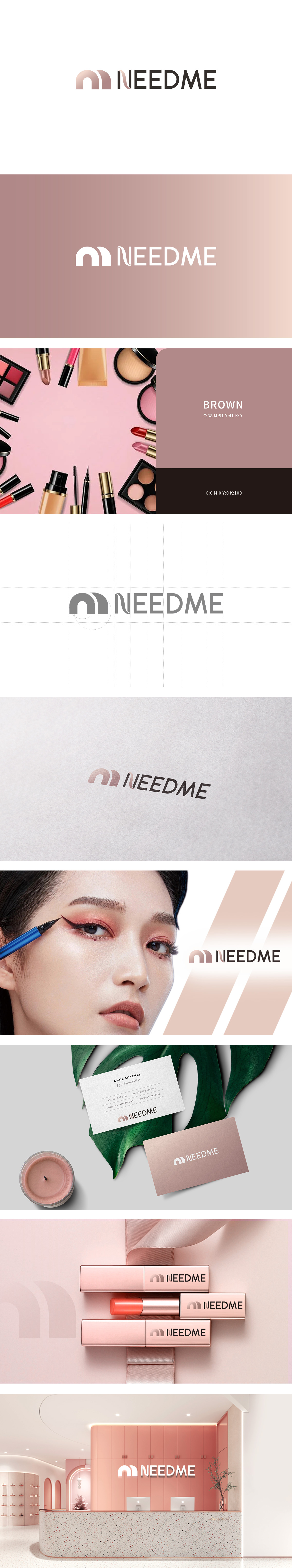
狮动设计以字母“N”为基础,通过双曲线重叠的设计,呈现出“花瓣舒展”“皮肤肌理”的意象——曲线的柔润感模拟了皮肤的细腻,重叠的结构则象征“陪伴”与“互动”,暗合“NEEDME(需要我)”的品牌主张,传递“品牌是用户护肤/美妆过程中的陪伴者”的理念。淡粉色模拟皮肤色调,传递“温柔呵护”的感觉;浅棕色传递“自然、无添加”的信任感,LOGO的图形(重叠曲线)与字体(“NEED+ME”)的组合,将这一理念“可视化”——图形象征“陪伴”,字体强调“需要我”,两者结合让品牌理念更直观、更有温度。
Based on the letter "N", Lion Dance design presents the image of "petal stretching" and "skin texture" through hyperbolic overlapping design —— the softness of the curve simulates the delicacy of the skin, and the overlapping structure symbolizes "companionship" and "interaction", which coincides with the brand proposition of "NEEDME" and conveys that "the brand is the companion of the user in the process of skin care/beauty. Pale pink simulates skin tone and conveys the feeling of "gentle care"; Light brown conveys the trust of "nature and no addition", and the combination of LOGO graphics .


扫码或拨打添加客服微信


