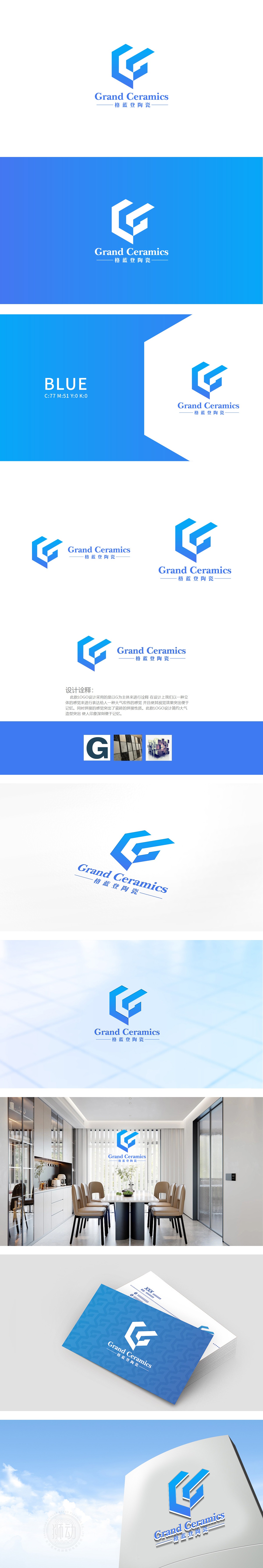
狮动设计将标志由立体几何图形与中英文文字两部分组成,主体是抽象化的“G”字母,通过重叠的立体六边形演绎而成,几何切割与立体层次感,模拟出陶瓷制品的“结构感”,同时传递出“现代、科技、工艺精湛”的品牌印象。整体设计把陶瓷的“本质”揉进了视觉基因里——立体图形里藏着瓷砖的结构感,蓝白配色里凝着青瓷的灵韵,连“G”字母的抽象化处理,都像陶瓷工匠手中的陶泥,经过千锤百炼,才变成了最有辨识度的“品牌面孔”。
Lion design consists of three-dimensional geometric figures and Chinese and English characters. The main body is the abstract "G" letter, which is deduced by overlapping three-dimensional hexagons. Through geometric cutting and three-dimensional layering, it simulates the "structural sense" of ceramic products and conveys the brand impression of "modernity, science and technology and exquisite craftsmanship". The overall design rubs the "essence" of ceramics into the visual gene-the structural sense of ceramic tiles is hidden in the three-dimensional graphics.


扫码或拨打添加客服微信


