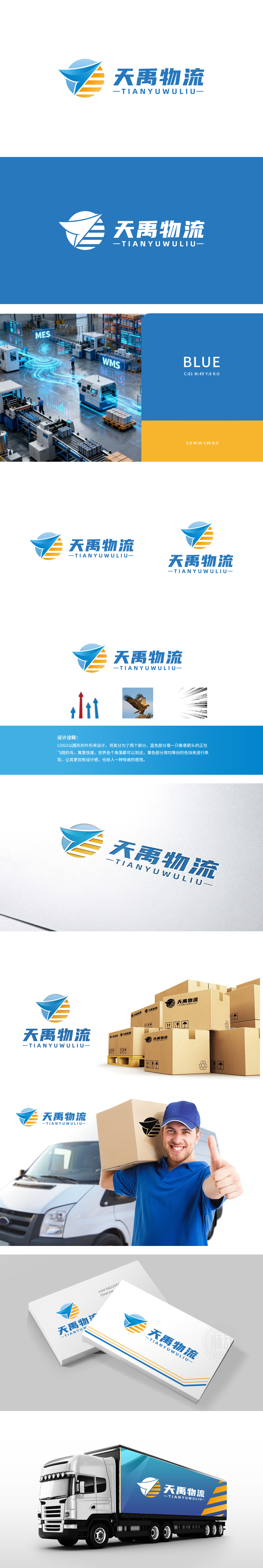
狮动设计以蓝色飞鸟为核心,翅膀呈流线型,搭配橙色横向条纹。蓝色:代表专业、可靠,符合物流企业“安全送达”的核心诉求;飞鸟:直接关联“运输”与“速度”,翅膀的线条模拟了空气流动的轨迹,视觉上强化“快速”的感受;橙色条纹:穿插在飞鸟下方,既像货物的堆叠(象征物流的“货量”),又像阳光或跑道,传递“活力”与“前进”的意味,缓解了蓝色的严肃感,让品牌更有温度。整体LOGO用“飞”的意象,将“天禹”中的“天”(天空、广阔)与“物流”的“动”(流动、运输)完美结合,直观传递“高效空运/快运”的品牌认知。
Lion design takes the blue bird as the core, and its wings are streamlined with orange horizontal stripes.Blue: represents professionalism and reliability, and meets the core demand of "safe delivery" of logistics enterprises;Birds: directly related to "transportation" and "speed", the lines of wings simulate the trajectory of air flow, and visually strengthen the feeling of "speed"; Orange stripes: Interspersed under the birds, they are not only like the stacking of goods .but also like the sunshine or the runway, conveying the meaning of "vitality" and "progress", alleviating the seriousness of blue and making the brand more warm.


扫码或拨打添加客服微信


