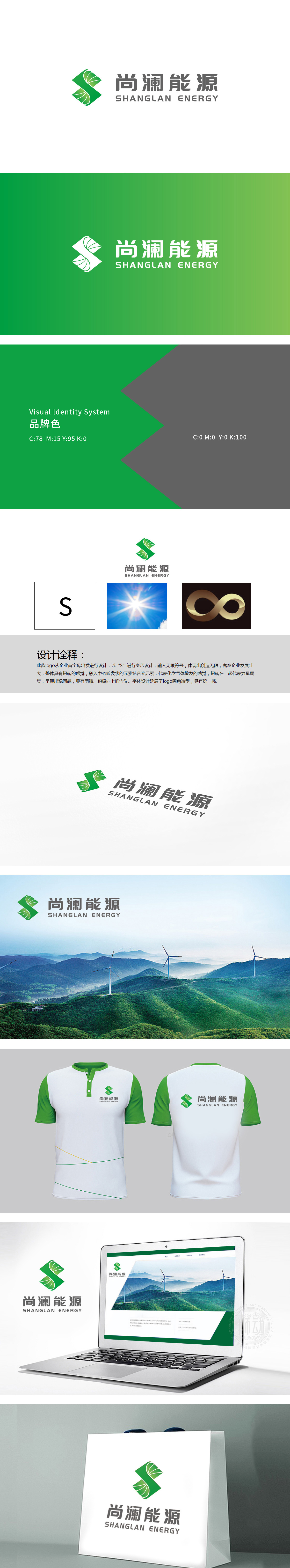
狮动设计提取“S”的核心符号,融入绿色的旋转叶片/能量漩涡造型,既模拟了风力发电机叶片的动态感,又暗含光伏板的阵列逻辑,“∞”既代表清洁能源的无限性,也象征企业长远发展的战略布局,同时绿色调直接对应“环保、自然”的清洁能源属性;整体通过“自然形态+科技感造型”的组合,精准点出“源于自然、科技赋能”的品牌内核——既强调能源的自然属性,也暗示企业对技术的依托。
Lion Design extracts the core symbol of "S" and incorporates the green rotating blade/energy vortex modeling, which not only simulates the dynamic sense of wind turbine blades, but also implies the array logic of photovoltaic panels. "∞ "not only represents the infinity of clean energy, but also symbolizes the strategic layout of long-term development of enterprises, and the green tone directly corresponds to the clean energy attributes of" environmental protection and nature ". As a whole, through the combination of "natural form+science and technology sense modeling".


扫码或拨打添加客服微信


