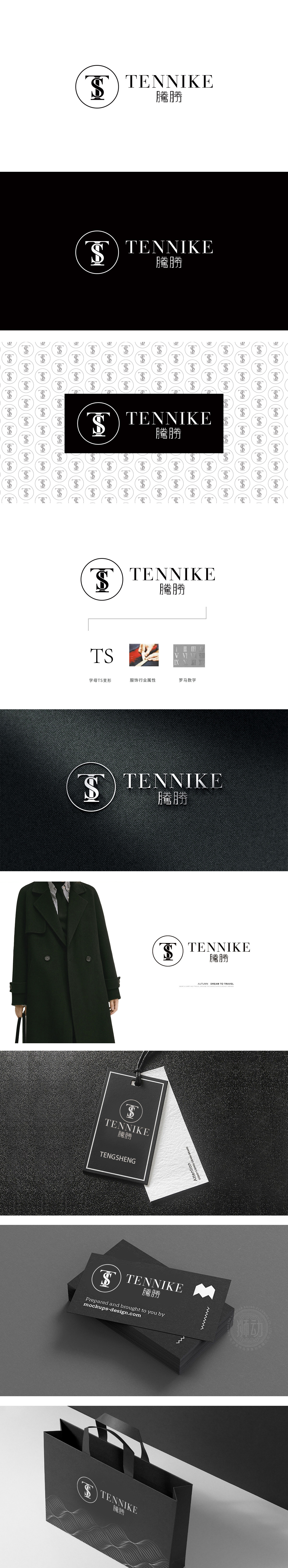
狮动设计采用圆形包裹的「TS」组合,圆形:作为最经典的几何形状,自带「和谐、完整、包容」的属性,符合女装品牌需要的「亲和力」与「百搭感」,「T」与「S」的组合:「T」是横平竖直的大写无衬线字体,线条刚硬、稳重,代表品牌的「品质感」与「确定性」;「S」是流畅的曲线,打破「T」的生硬,传递「女性的柔软与灵动」——刚柔并济的组合,完美匹配「极简女装」的核心诉求,用「极简」的方式,把品牌的「内核」精准地「视觉化」。
Lion design adopts the combination of "TS" wrapped in a circle. Circle: as the most classic geometric shape, it has the attributes of "harmony, integrity and tolerance", which meets the needs of women's clothing brands with "affinity" and "sense of versatility". The combination of "T" and "S": "T" is a horizontal and vertical capital sans serif font with rigid and steady lines, representing the brand. "S" is a smooth curve, which breaks the rigidity of "T", conveys "softness and agility of women"-a combination of rigidity and flexibility.


扫码或拨打添加客服微信


