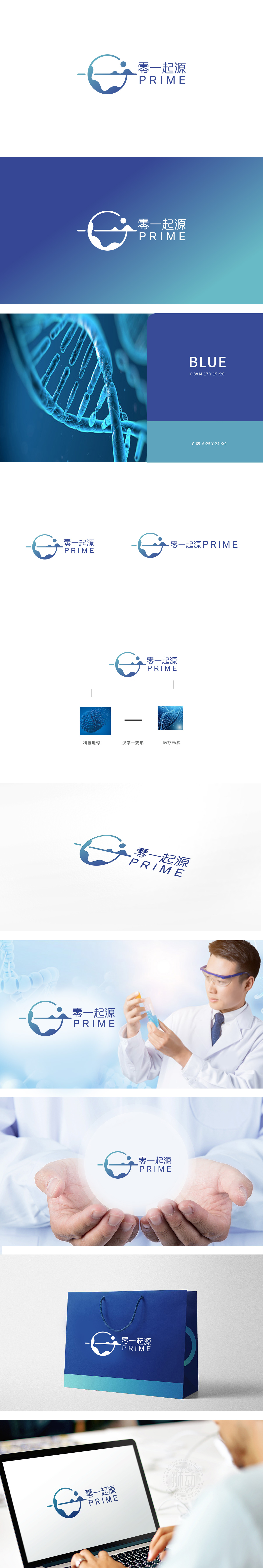
狮动设计以「科技地球」为基底,既呼应了「零一」的品牌名称,又通过「地球」符号传递了「全球视野」的格局感;「横线+圆点」设计,既是「汉字「一」的抽象变形」,更承担了「连接者」的角色,形成「科技→连接→医疗」的隐含叙事;英文「PRIME」(译为「核心、首要」)则强化了品牌的「核心价值」定位,与中文名称形成「国际化+本土化」的平衡。整体通过「科技符号→连接符号→医疗符号」的递进**,将抽象的「赋能」转化为可感知的「视觉关系」;整体风格统一(蓝调、极简、几何化),既符合科技品牌的「理性感」,又传递了医疗服务的「可靠性」。
Lion design is based on "Science and Technology Earth", which not only echoes the brand name of "Zero One", but also conveys the sense of "global vision" through the symbol of "Earth". The design of "horizontal line+dot" is not only the abstract deformation of the Chinese character "one", but also assumes the role of "connector", forming the implied narrative of "technology → connection → medical treatment"; English "PRIME" (translated as "core and first") strengthens the brand's "core value" positioning and forms a balance of "internationalization+localization" with Chinese names.


扫码或拨打添加客服微信


