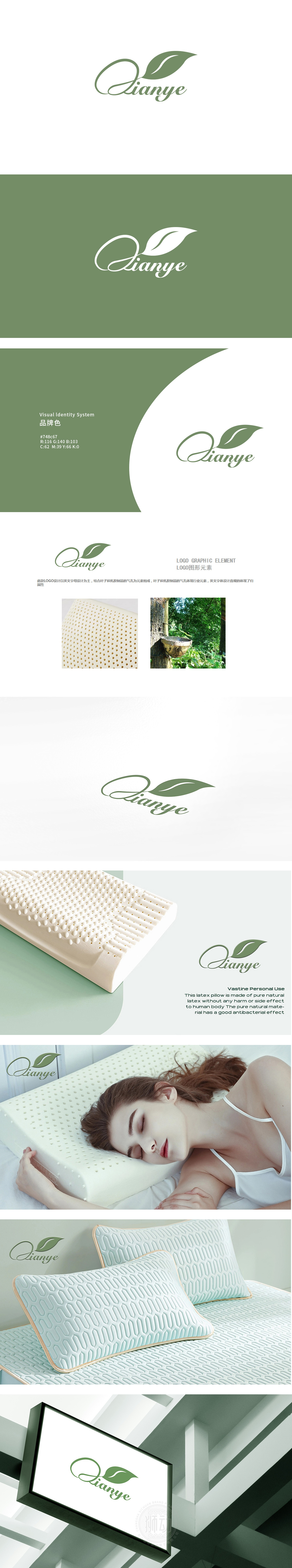
狮动设计采用字母“Q”变形为流畅的曲线形态,上方叠加浅绿的叶子,绿叶(乳胶的原料来源),用自然植物符号传递“天然、环保”的产品属性,整体设计用“曲线+叶子”传递“自然、柔和”的情感(符合睡眠产品定位),实现“看LOGO→想产品→记功能”的联想,是藏在设计里的“视觉呼吸感”里。
Lion Design uses the letter "Q" to transform into a smooth curve shape, with light green leaves and green leaves (the raw material source of latex) superimposed on it. Natural plant symbols are used to convey the product attributes of "nature and environmental protection", and the overall design uses "curve+leaves" to convey the feelings of "nature and softness" (in line with the positioning of sleeping products).


扫码或拨打添加客服微信


