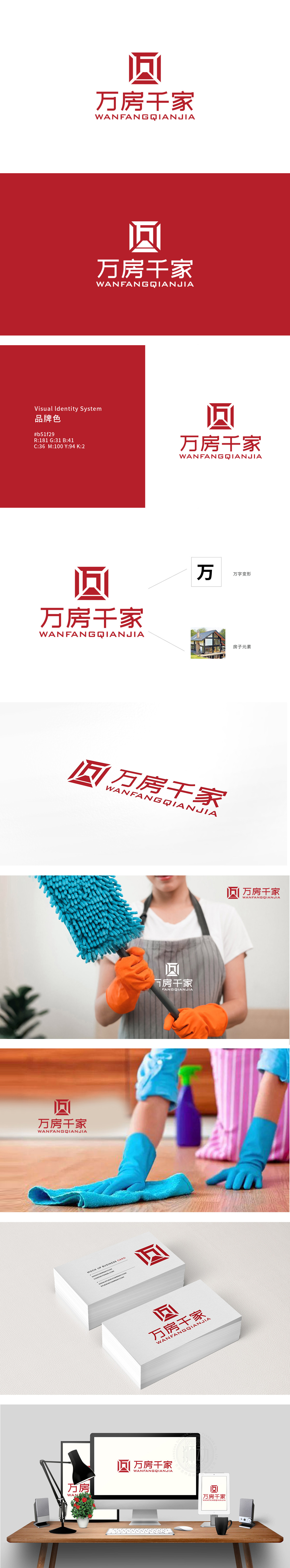
狮动设计将万”字采用几何切割手法,保留了汉字的辨识度,同时通过上下对称的结构,模拟出“房子”的基本形态(屋顶+墙体);“万”代表房源规模(覆盖广),“千”代表客户群体(惠及多),“房”与“家”则串联起“业务”(房子)与“情感”(家)的逻辑链,让用户瞬间理解“这是一个做房子相关的大平台”。红色调的选择非常巧妙——既符合中国人对“喜庆、稳定”的心理认知,又通过高饱和度强化了品牌记忆点。
Lion design uses geometric cutting technique to preserve the recognition of Chinese characters, and at the same time simulates the basic form of "house" (roof+wall) through the symmetrical structure up and down; "10,000" represents the scale of the house (covering a wide area), "1000" represents the customer group (benefiting a lot), and "house" and "home" are connected in series to form the logical chain of "business" (house) and "emotion" (home), so that users can instantly understand that "this is a big platform related to building a house".


扫码或拨打添加客服微信


