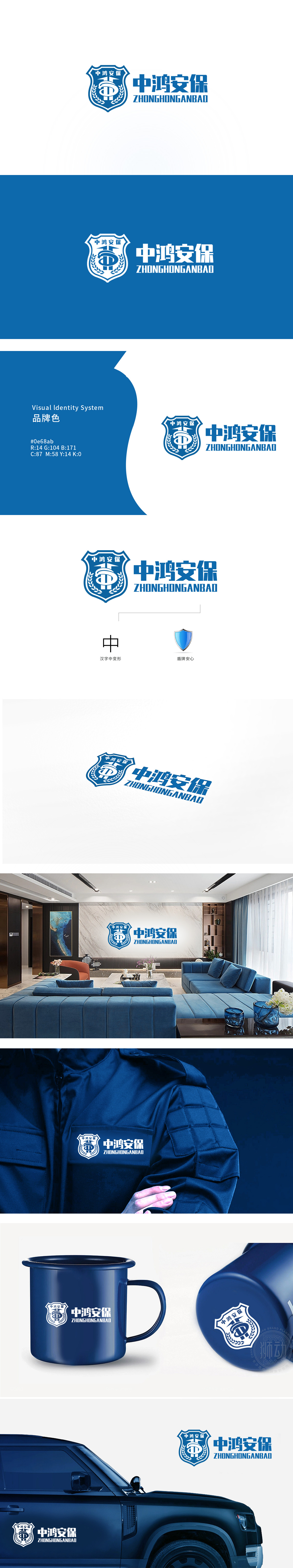
狮动设计采用盾牌,「盾牌是安心」的符号,中间的「1」形符号+环绕的曲线,像一把「锁」或「守护圈」,强化了「专业守护」的感觉;两侧的橄榄枝(和平象征),把保安的「刚性」软化成了「温柔的保护」。「中」是「中鸿安保」的核心,用极简的线条变形,把「中国品牌」的辨识度与「家庭场景」的联想结合了起来——这刚好契合家政服务的「家庭属性」;变形后的「中」字又像一个「支撑柱」,暗示无论是保安还是家政(照顾家庭),品牌都是用户的「可靠后盾」。整体设计,连接传统与现代,覆盖家政的情感需求。
Lion design adopts a shield, with the symbol of "shield is reassuring", and the "1" symbol in the middle+the surrounding curve, like a "lock" or "guard circle", enhances the feeling of "professional guard"; Olive branches (symbols of peace) on both sides soften the "rigidity" of security guards into "gentle protection". "Zhong" is the core of "Zhonghong Security", which combines the recognition of "China brand" with the association of "family scene" with minimalist line deformation, which just fits the "family attribute" of domestic service; The deformed word "Zhong" is like a "support pillar".implying that the brand is the "reliable backing" of users.


扫码或拨打添加客服微信


