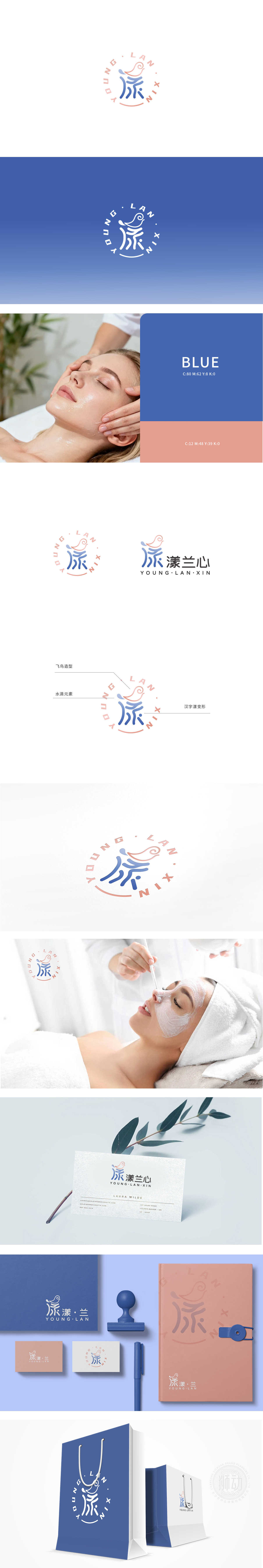
狮动设计以「水」为核心线索),通过三种元素的叠加,将抽象的「水感」转化为可感知的视觉符号:「漾」字上方的粉色曲线勾勒出一只飞鸟的轮廓,鸟的身体与水滴的曲线自然衔接,翅膀的弧度与「漾」字的涟漪笔画呼应,形成「水化作鸟」的隐喻。这种设计将「水」的特性从「静态」推向「动态」,传递出「轻盈、自由、灵动」的情感体验(对应美容后「肌肤轻松、身心愉悦」的状态)。通过环形的「圆满感」传递品牌的「周全服务」理念。整体从「功能」到「体验」的升维,让用户通过符号联想到「美好状态」,增强了品牌的亲和力。
Lion design takes "water" as the core clue), and through the superposition of three elements, the abstract "water sense" is transformed into a perceptible visual symbol: the pink curve above the word "Yang" outlines the outline of a bird, the bird's body naturally connects with the curve of water droplets, and the radian of its wings echoes the ripple strokes of the word "Yang", forming a metaphor of "watery bird". This design pushes the characteristics of "water" from "static" to "dynamic".conveying the emotional experience of "lightness, freedom and agility" (corresponding to the state of "relaxed skin and happy body and mind.


扫码或拨打添加客服微信


