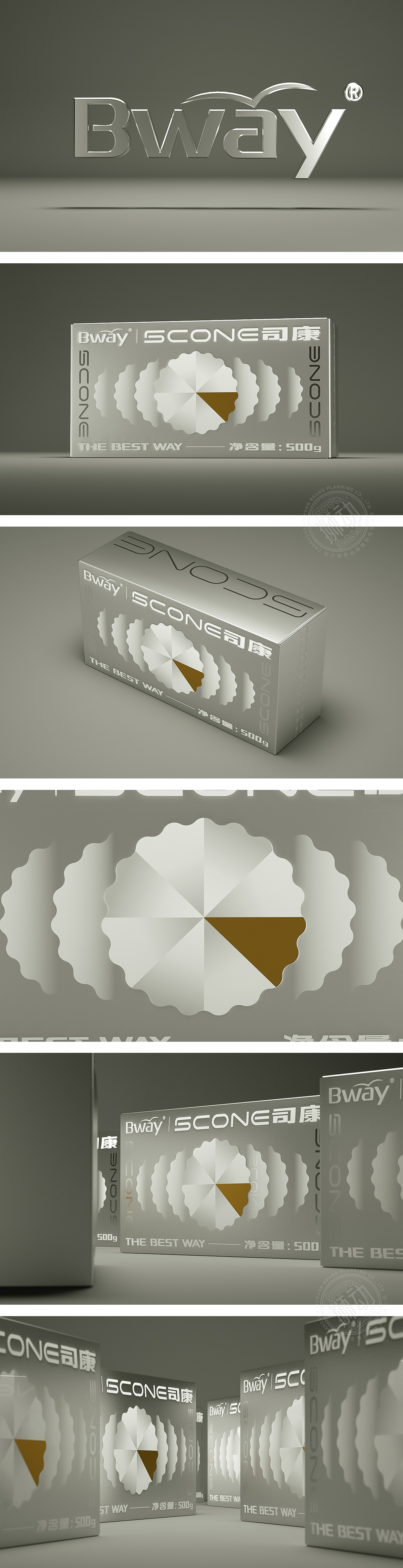
狮动设计采用以产品为中心”,通过几何化符号、重复元素、色彩对比**,让消费者在3秒内抓住核心信息:视觉焦点:中间几何化司康图案,这个图案是产品的“视觉符号化”——用极简的几何形状还原司康的经典形态,同时用棕色小色块模拟“咬痕”,既保留了食物的温度感,又通过“不完整”的细节激发消费者的联想,图案周围用渐变阴影做了“扩散效果”,像相机对焦一样,把视线强行“拉”到中间,形成**“中心爆炸”的视觉冲击。一是通过“竖条”平衡中间圆形的“膨胀感”,让画面更稳定;二是“重复曝光”**——竖排文字打破了常规的横排习惯,更容易被记住。用“色彩与质感”传递“高端简约”的定位,“简约而不简单”的设计智慧。
Lion design adopts product as the center. Through geometric symbols, repeated elements and color contrast * *, consumers can grasp the core information within 3 seconds: visual focus: geometric Si Kang pattern in the middle, which is the "visual symbol" of the product-restoring the classic form of Si Kang with minimalist geometric shapes, and simulating "bite marks" with brown small color blocks, which not only retains the temperature sense of food, but also passes the "incompleteness". One is to balance the "swelling feeling" of the middle circle through "vertical bars" to make the picture more stable; The second is "repeated exposure" vertical text breaks the conventional horizontal habit and is easier to remember.


扫码或拨打添加客服微信


