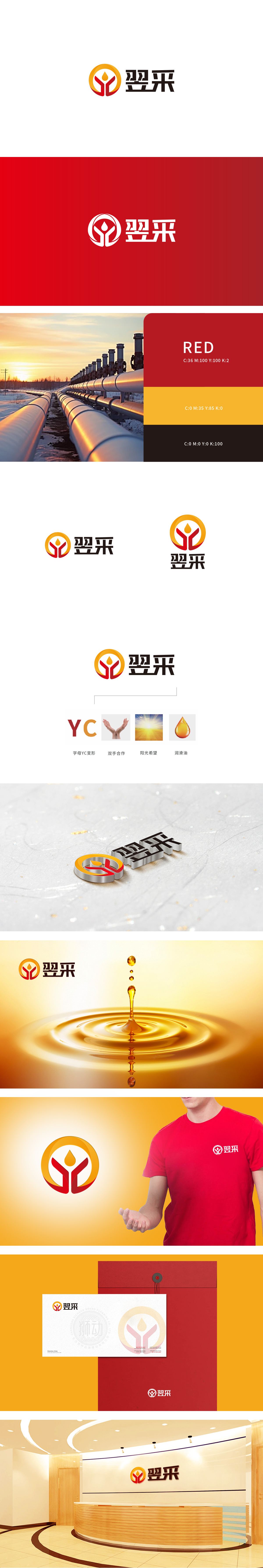
狮动设计以左侧为视觉符号(橙色圆环+红色Y形+黄色油滴),橙色圆环:象征“圆满、包容”,同时橙色属于“活力色”,传递润滑油行业的“动力感”与“专业温度”;红色Y形结构:既是品牌缩写“YC”的变形,也模拟了“双手托举”的形态,红色强化“信任”与“热情”的感知;黄色模拟油液的“流动感”与“光泽度”,突出行业属性。汉字“翌采”采用粗体无衬线字体,字形方正有力,传递“稳重、可靠”的品牌形象;整体设计通过“具象符号+抽象理念”的组合,实现了“品牌识别”与“价值传递”的双重目标。
Lion design takes the left side as the visual symbol (orange circle+red Y-shape+yellow oil drop).Orange circle: it symbolizes "completeness and tolerance", and orange belongs to "vitality color", which conveys the "power sense" and "professional temperature" of lubricating oil industry; Red Y-shaped structure: it is not only the deformation of brand abbreviation "YC", but also simulates the form of "two-handed lifting", and red strengthens the perception of "trust" and "enthusiasm".Yellow simulates the "fluidity" and "glossiness" of oil, highlighting the industry attributes. The Chinese character "Yicai" adopts a bold sans serif font.


扫码或拨打添加客服微信


