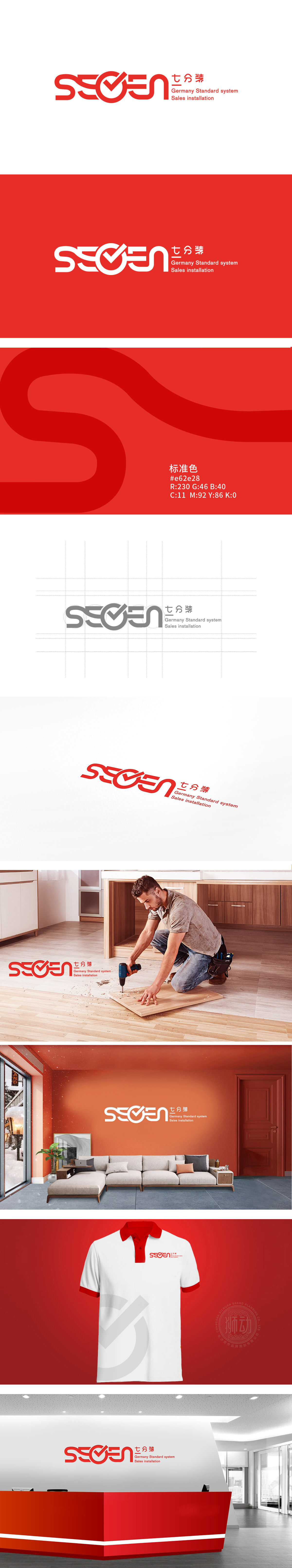
狮动设计以“图形+文字”的组合形式呈现,左侧为变形的“SEVEN”,。字母“V”被设计为对勾符号(√):这一设计是整款LOGO的“灵魂”——对勾象征“正确、完成、可靠”,直接关联家居,字母“S”“E”“N”的处理:均采用粗线条、圆转角设计,强化“柔和、舒适”的家居氛围。整体采用无衬线字体,线条圆润流畅,符合家居行业“温馨、可靠”的属性;诠释了品牌“聚焦安装工艺、提供高品质家居服务”的核心定位,红色为主色调,高饱和度的红既提升视觉冲击力(吸引注意力),又传递“热情、活力、值得信赖”的品牌形象。
Lion design is presented in the form of "graphics+words", with the deformed "SEVEN" on the left. The letter "V" is designed as a tick symbol (√): this design is the "soul" of the whole LOGO-the tick symbol is "correct, complete and reliable", which is directly related to home.Handling of letters "S", "E" and "N": thick lines and round corners are used to strengthen the "soft and comfortable" home atmosphere. The whole font is sans serif, and the lines are round and smooth,which conforms to the "warm and reliable" attribute of the home industry.


扫码或拨打添加客服微信


