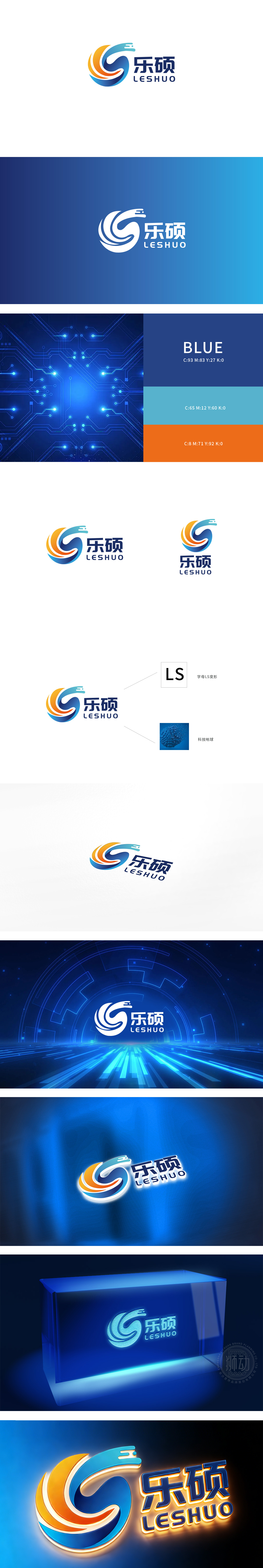
狮动设计将字母“S”的抽象化,通过曲线的扭曲与叠加,将字母转化为更具记忆点的视觉符号,强化品牌识别性;波浪/漩涡的意象:多层渐变曲线形成“向内汇聚、向外扩散”的漩涡感,象征“凝聚力量、持续生长”;同时曲线的流动感模拟波浪,传递“活力、灵动”,暗示品牌“向上发展”的趋势,弥补了漩涡可能带来的“内敛”,平衡了“稳”与“活”。整体用“动态平衡”匹配“成长型品牌”定位,用“流动感”串联“活力”与“专业”,传递“可靠、科技、理性”。
Lion design abstracts the letter "S", and through the distortion and superposition of curves, the letter is transformed into a visual symbol with more memory points, which strengthens brand recognition; Image of wave/vortex: The multi-layer gradient curve forms a vortex feeling of "inward convergence and outward diffusion", which symbolizes "cohesive strength and sustainable growth"; At the same time, the fluidity of the curve simulates waves, conveys "vitality and agility", implies the trend of "upward development" of the brand.


扫码或拨打添加客服微信


