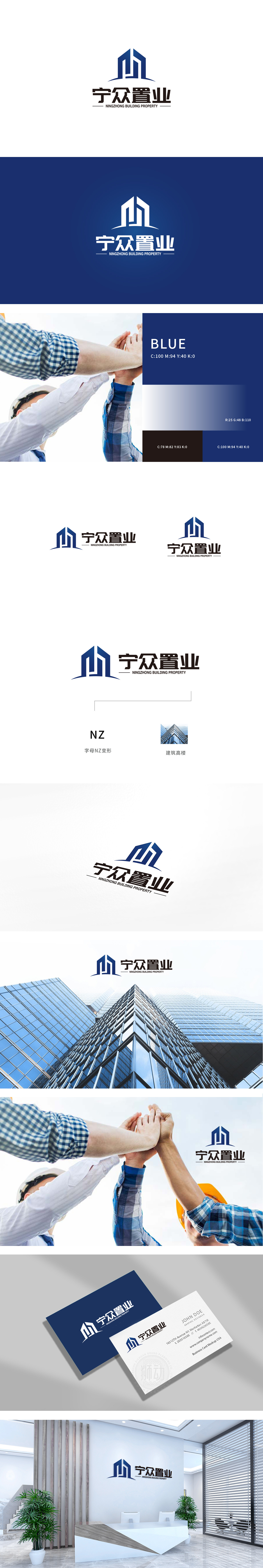
狮动设计以首字母「NZ」变的形,「N」的竖线像高楼的框架,「Z」的折线刚好折出了楼顶的轮廓,组合起来就像两栋现代感十足的玻璃幕墙建筑,棱角分明、线条干净,完全就是房地产行业的「专属符号」——哪怕不看文字,也能立刻get到「这是做置业的公司」,特别直观!,蓝色选得太懂了!像天空、像高楼的玻璃,给人一种「专业、可靠、稳当」的感觉,把“房屋”的灵魂,刻进了建筑的视觉里。
Lion design is shaped by the initial "NZ", the vertical line of "N" is like the frame of a high-rise building, and the broken line of "Z" just folds out the outline of the roof. Together, it is like two modern glass curtain wall buildings with sharp edges and clean lines, which is completely the "exclusive symbol" of the real estate industry-even if you don't look at the text, you can immediately get "This is a home buyer's company", which is particularly intuitive! , blue is too well chosen!


扫码或拨打添加客服微信


