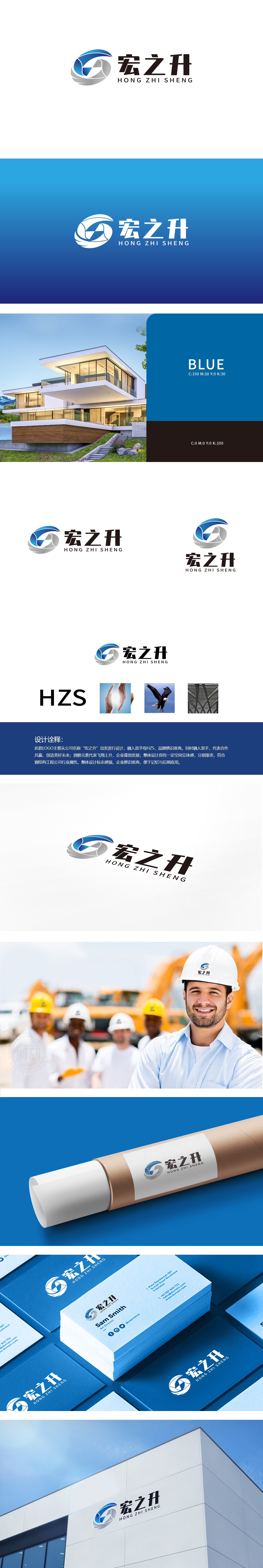
狮动设计将首字母HZS变形设计,H的具象化:蓝色区域的曲线轮廓似“展开的双手”,又传递“合作共赢”的寓意;Z/S的整合:灰色区域的渐变线条形成“翅膀”的轮廓(象征企业“蓬勃发展、业绩攀升”的愿景,同时“翅膀”的轻盈感平衡了钢结构行业的“厚重感”,让品牌更具活力;整体设计通过“首字母图形化”解决了辨识度问题,通过“双手+翅膀+钢结构”解决了寓意与行业属性问题,通过“颜色+结构”解决了视觉调性问题;三大元素的“具象化符号”,品牌故事一看就懂。
Lion design transforms the initials HZS, and H is concrete: the curve outline of the blue area is like "open hands" and conveys the meaning of "win-win cooperation"; Z/S integration: the gradual lines in the gray area form the outline of "wings" (symbolizing the vision of "vigorous development and rising performance" of enterprises, while the lightness of "wings" balances the "heaviness" of steel structure industry and makes the brand more dynamic; The overall design solves the problem of recognition through "graphic initials".


扫码或拨打添加客服微信


