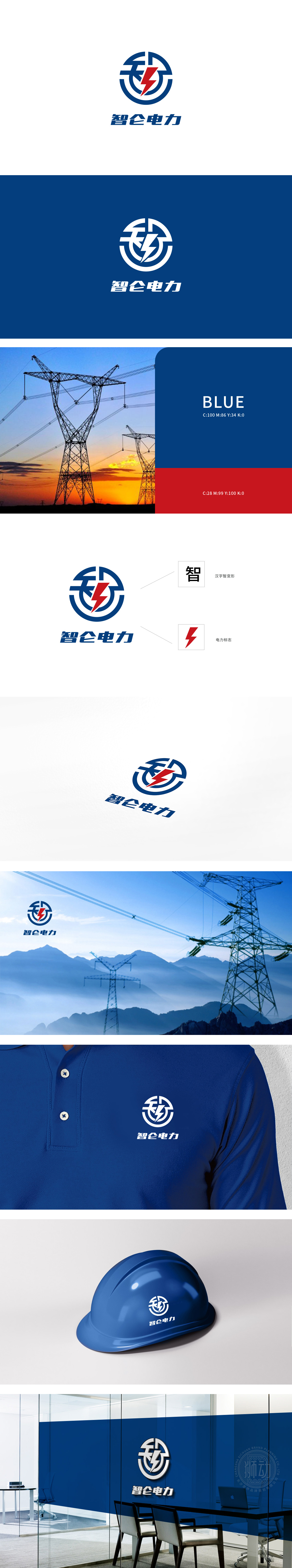
狮动设计以蓝色为主色调,将“智”字的笔画转化为“电网”的形态,既保留了“智能”的文字含义,又通过“电网”的符号暗示“电力传输”的行业属性,实现“文字-行业”的双关。闪电的作用:红色闪电作为“电力”的强符号,不仅直接点出行业特征,更通过“闪电”的“速度、能量、突破”属性,隐喻“智能电力”的高效、创新、动力感。用“对比色”平衡专业与活力,用“强符号”构建认知锚点,用“双关性”传递品牌价值。
Lion design takes blue as the main tone, and transforms the strokes of the word "wisdom" into the form of "power grid", which not only retains the literal meaning of "intelligence", but also implies the industrial attribute of "power transmission" through the symbol of "power grid", thus realizing the pun of "text-industry". The role of lightning: As a strong symbol of "electricity", red lightning not only directly points out the characteristics of the industry.


扫码或拨打添加客服微信


