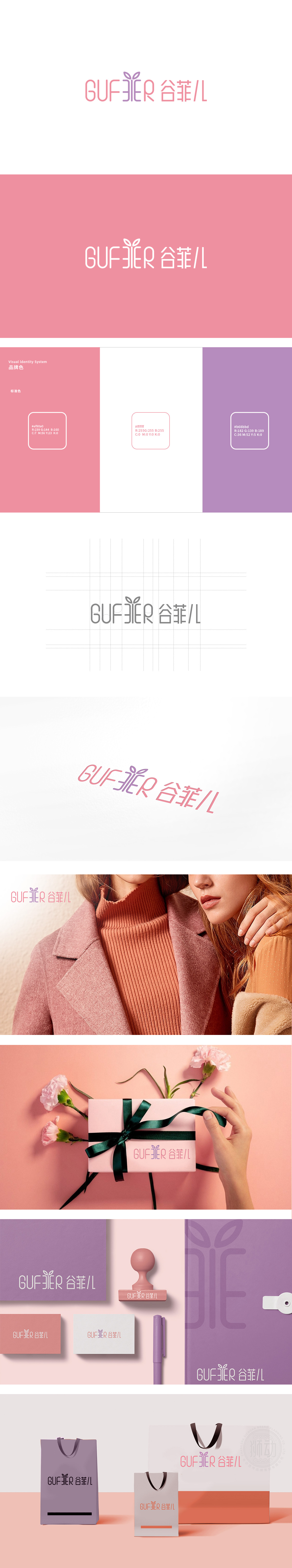
狮动设计采用圆润无衬线字体,字母「U」「F」「E」的曲线处理,传递「温柔」;而「G」「R」的直线收尾(如「G」的竖线、「R」的折角)则保留了「利落」,这种「柔中带刚」的字体,恰好对应当代女性「独立且温柔」的审美诉求。中文「谷菲儿」采用极简线条字体,笔画粗细均匀,但通过「儿」字的斜钩增加了一丝「灵动」,叶形的「轻盈感」与整体的「柔和色调」结合,暗示品牌「自然、清新」的风格,整体设计通过「圆润字体」传递「温柔」,「淡紫+淡粉」传递「时尚」,「叶形符号」传递「自然」,三者共同构建了「谷菲儿」「年轻、优雅、亲切」的品牌形象。
Lion design adopts a round sans-serif font, and the letters "U", "F" and "E" are curved to convey "gentleness"; However, the straight ending of "G" and "R" (such as the vertical line of "G" and the corner of "R") keeps "neat", and this kind of font with "softness in the middle and rigidity" just corresponds to the aesthetic appeal of contemporary women. The Chinese character "Gu Fei 'er" adopts a minimalist line font with even strokes, but it adds a touch of agility through the oblique hook of the word "Er". The combination of the lightness of the leaf shape and the overall "soft tone" implies the brand's "natural and fresh" style.


扫码或拨打添加客服微信


