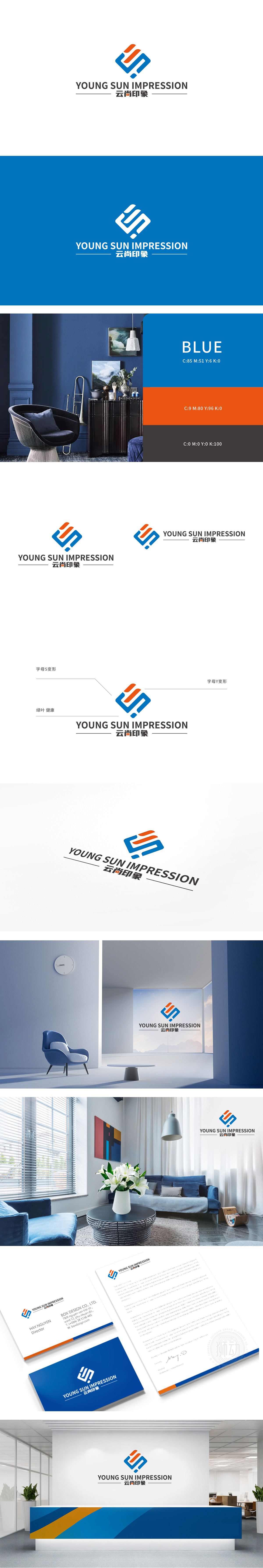
狮动设计采用S是「空间的首字母,曲线形态模拟家居动线的「流畅性」,比如客厅到卧室的过渡、开放式厨房的动线设计,都需要「无阻碍的流动感」。S的弧度也像「沙发的轮廓」或「窗帘的褶皱」,自带「柔软感」,符合家居「舒适」的核心需求;Y的分叉结构也像「家庭的分支」(父母+孩子),隐喻「家居空间的包容性」,符合「家是港湾」的情感诉求;S与Y的组合:曲线与直线的碰撞,恰好对应家居设计中「柔与刚」的平衡, 家居装饰中,色彩是情绪的第一传递者,而蓝橙配色的选择恰好贴合「现代家庭」的需求,整体用极简的图形语言,精准传递了家居装饰的核心价值:快速联想到「家」的样子——一个流动、温暖、健康、有秩序的空间。
Lion Lion design S is "the initial letter of space", and the curve shape simulates the "fluency" of home moving lines, such as the transition from living room to bedroom and the moving line design of open kitchen, all of which need an "unobstructed sense of flow". The radian of S is also like "the outline of sofa" or "the fold of curtain", which has its own "softness" and meets the core demand of "comfort" in home. The bifurcated structure of Y is also like "branch of family" (parents+children), which means "inclusiveness of home space" and accords with the emotional appeal of "home is a harbor". The combination of S and Y: the collision between curve and straight line just corresponds to the balance between softness and rigidity in home design. In home decoration.


扫码或拨打添加客服微信


