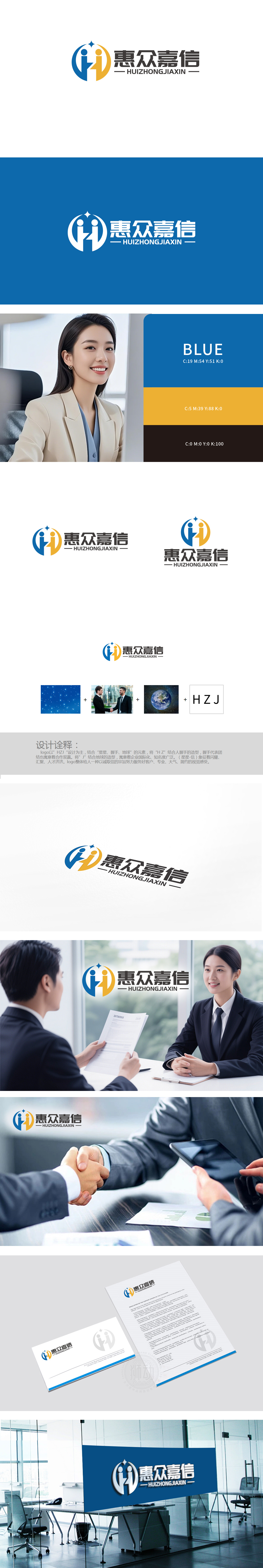
狮动设计将品牌简称“HZJ”从抽象字母转化为有温度、有寓意的视觉符号,实现了“识别性”与“内涵性”的双重兼顾:“HZ”= 握手造型:将“Η”与“Z”的笔画拆解重构,模拟两人握手的动态 ,传递“合作双赢”。握手的姿态自然、有力,既象征企业与客户的信任联结,也暗含团队内部的团结,符合“惠众嘉信”“以信为基”的品牌调性。“J”= 地球造型:将“J”的竖画与地球的曲线融合,直接关联“国际化”与“知名度广泛”的品牌目标。地球的蓝绿色调与星空的蓝色形成呼应,强化了“全球视野”的视觉感知,星星(星空):对应“闪耀、汇聚、人才济济”,用视觉讲好品牌故事”,让品牌理念“看得见、读得懂、记得住”。
Lion Design transforms the brand abbreviation "HZJ" from an abstract letter into a visual symbol with temperature and meaning, realizing the dual consideration of "recognition" and "connotation": "Hz" = handshake modeling: disassembling and reconstructing the strokes of "η" and "Z", simulating the dynamics of two people shaking hands and conveying "win-win cooperation". The gesture of shaking hands is natural and powerful, which not only symbolizes the trust connection between enterprises and customers, but also implies the unity within the team.which is directly related to the brand goals of "internationalization" and "wide popularity".


扫码或拨打添加客服微信


