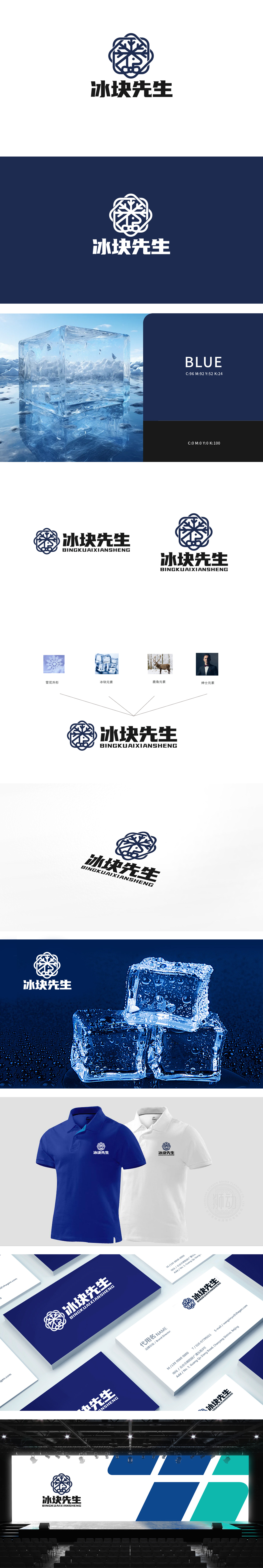
狮动设计采用了雪花的六边形对称结构,既呼应了“冰”的自然属性,又通过几何化处理让图形更现代、易识别(瞬间唤醒“清凉”的感官联想)。冰块元素:直接指向产品的核心原料“冰”,强化“冰品”的品类认知,鹿角元素:隐含鹿角的优雅形态,既增加了图形的层次感,又传递了“天然、纯粹”的产品卖点,蓝白为主色调(蓝代表冷静、科技;白代表纯净、清爽),完美契合“冰”的视觉联想,用颜色与风格强化“冰品印象”,用图形讲“消费场景”。
Lion design adopts the hexagonal symmetrical structure of snowflakes, which not only echoes the natural attribute of "ice", but also makes the graphics more modern and easy to identify through geometric processing (instantly arousing the "cool" sensory association). Ice cube element: directly points to the core raw material "ice" of the product, and strengthens the category cognition of "ice products". Antler element: implies the elegant shape of antlers, which not only increases the layering of graphics, but also conveys the selling point of "natural and pure" products, with blue and white as the main color (blue represents calmness and technology.


扫码或拨打添加客服微信


