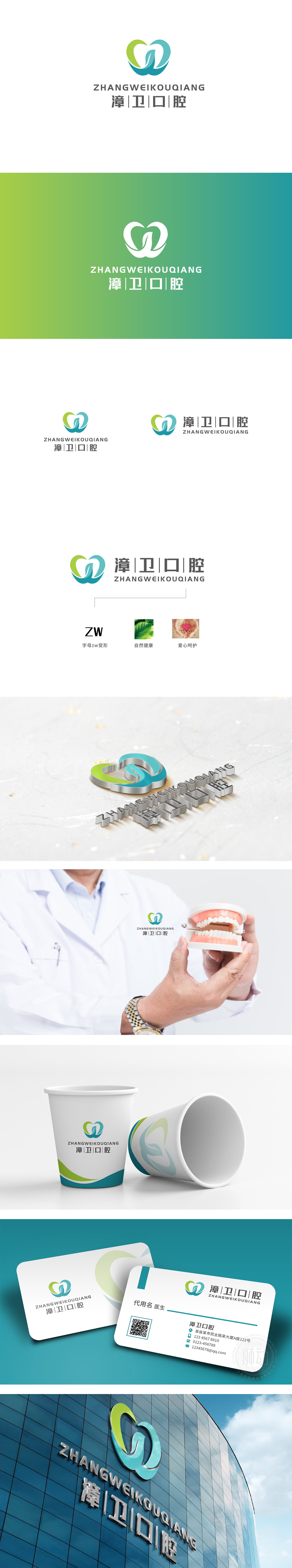
狮动设计以“漳卫”的首字母“ZW”为基底,绿色曲线勾勒出“Z”的轮廓,蓝色曲线形成“W”的形态,两者交织成一个闭合的“心”形——既呼应了“ZW”的品牌缩写,又暗合“爱心呵护”的服务理念;用鲜活的绿叶特写,将“自然”从文字变成“可感知的生命力”,呼应口腔护理中“天然、安全”的需求;色彩逻辑:绿色(生机、健康)+ 蓝色(专业、可靠)的组合,完美平衡了“医疗专业感”与“服务温度感”,符合口腔机构“专业且贴心”的客户期待。整体用“可视化符号”强化记忆从“识别”到“共情”的闭环。
Lion Design is based on the initials "ZW" of "Zhangwei", the green curve outlines the outline of "Z", and the blue curve forms the shape of "W", and the two are intertwined into a closed "heart" shape, which not only echoes the brand abbreviation of "ZW" but also coincides with the service concept of "love and care". Close-up with fresh green leaves will change "nature" from words to "perceptible vitality", echoing the demand of "nature and safety" in oral care; Color logic: the combination of green (vitality and health) and blue (professionalism and reliability) perfectly balances the sense.


扫码或拨打添加客服微信


