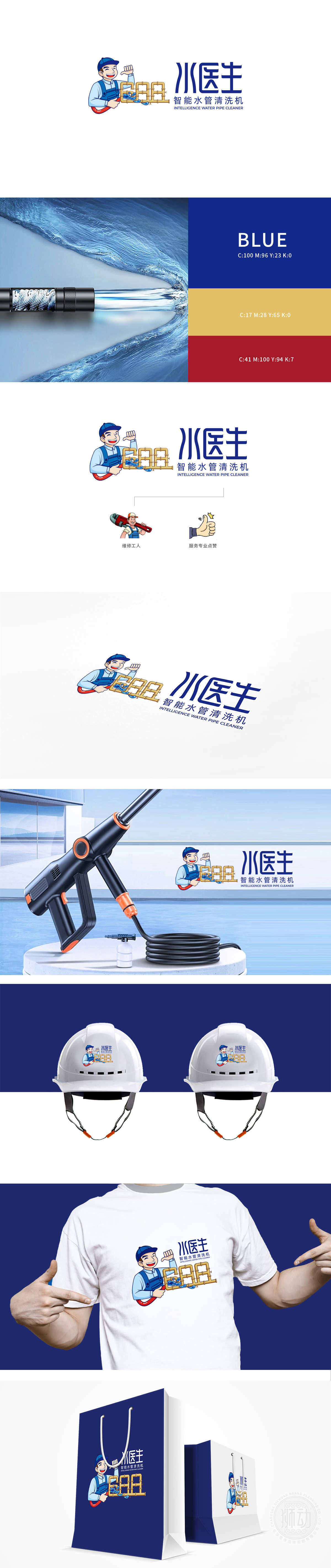
狮动设计采用扁平卡通风格,工人穿着经典的蓝白工装+蓝帽子,符合大众对“水电师傅”的固有印象,瞬间唤醒“专业服务”的联想;手中的红色水管:直接关联“水管清洗”的核心功能,且红色作为“活跃色”,强化“正在工作”的动态感。整体通过圆润的线条、鲜艳的色块和拟人化形象,构建了亲民形象。同时,蓝、金、红的配色组合又保留了专业属性:全场景覆盖:从“产品功能”(清洗/维修)到“服务体验”(专业/好评),用最少的元素传递了最完整的行业信息。
Lion design adopts flat cartoon style, and the workers wear classic blue and white tooling+police tactical unit, which conforms to the inherent impression of the public on "hydropower master" and instantly awakens the association of "professional service";The red water pipe in the hand is directly related to the core function of "water pipe cleaning", and red is used as an "active color" to strengthen the dynamic sense of "working". As a whole, through rounded lines, bright color blocks and anthropomorphic images, the image of being close to the people has been constructed. At the same time, the color combinations of blue, gold and red retain the professional attributes: full scene coverage: from "product function" (cleaning/maintenance) to "service experience".


扫码或拨打添加客服微信


