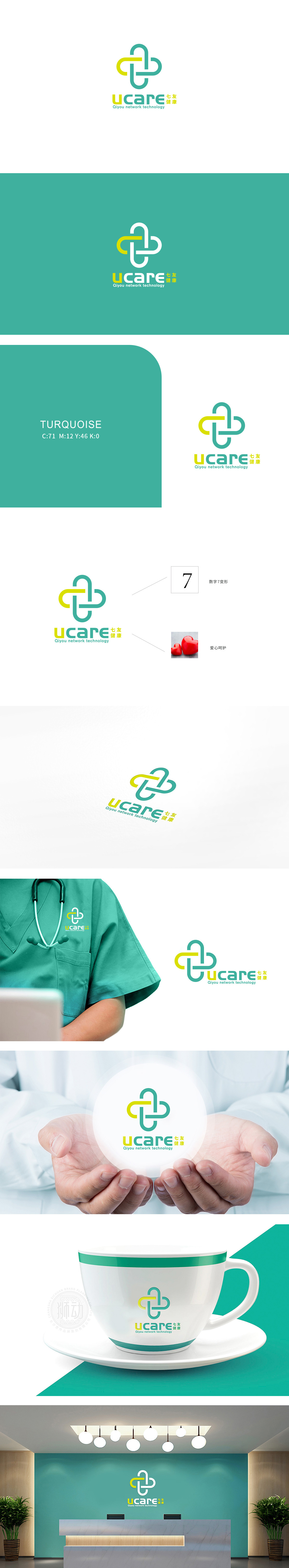
狮动设计以数字7变形:作为“七友健康”的视觉符号,将数字抽象为简洁的图形,既强化了品牌的独特性,又通过“变形”传递出“灵活、适配”的服务特性;绿色与黄色(活力温暖)为主色调,用交织的曲线重构了“医疗十字”的经典符号,既保留了医疗场景的辨识度,又传递出“持续陪伴”“双向连接”的情感。整体用“符号化+情感化”的语言,把医疗服务的核心(专业、温暖、连接、科技)拆解成可视觉化的元素,又通过颜色、谐音、符号的巧思,让品牌显得“有温度、有记忆点、有科技感”。
Lion design transforms the number 7: as a visual symbol of "Seven Friends Health", it abstracts the number into concise graphics, which not only strengthens the uniqueness of the brand, but also conveys the service characteristics of "flexibility and adaptability" through "transformation"; Green and yellow (energetic and warm) are the main colors, and the classic symbol of "medical cross" is reconstructed with interlaced curves, which not only retains the recognition of medical scenes, but also conveys the emotion of "continuous companionship" and "two-way connection".


扫码或拨打添加客服微信


