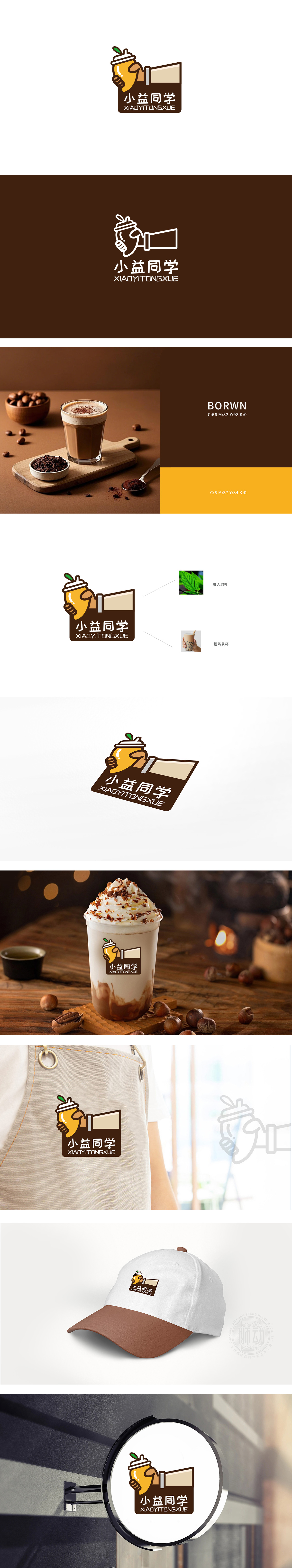
狮动设计以卡通化的手臂+握杯动作作为视觉核心,用「手」的形态模拟消费者拿奶茶的日常动作,瞬间引发共鸣,绿叶与奶茶的完美融合,既点出了「新鲜」「天然」的产品卖点,又为整体增添了一丝活泼的灵动感。整体设计采用扁平化+Q版风格,线条圆润、色彩柔和:一眼就能记住的「符号化」,完全符合奶茶品牌「好喝、好记、好亲切」的三大需求。
Lion design takes the cartoon arm+cup-holding action as the visual core, and uses the shape of "hand" to simulate the daily actions of consumers holding milk tea, which instantly resonates. The perfect integration of green leaves and milk tea not only points out the selling point of "fresh" and "natural" products, but also adds a touch of lively spirit to the whole. The overall design adopts the flat +Q version style, with rounded lines and soft colors: the "symbolization" that can be remembered at a glance fully meets the three major needs of the milk tea brand "delicious, easy to remember and friendly"!


扫码或拨打添加客服微信


