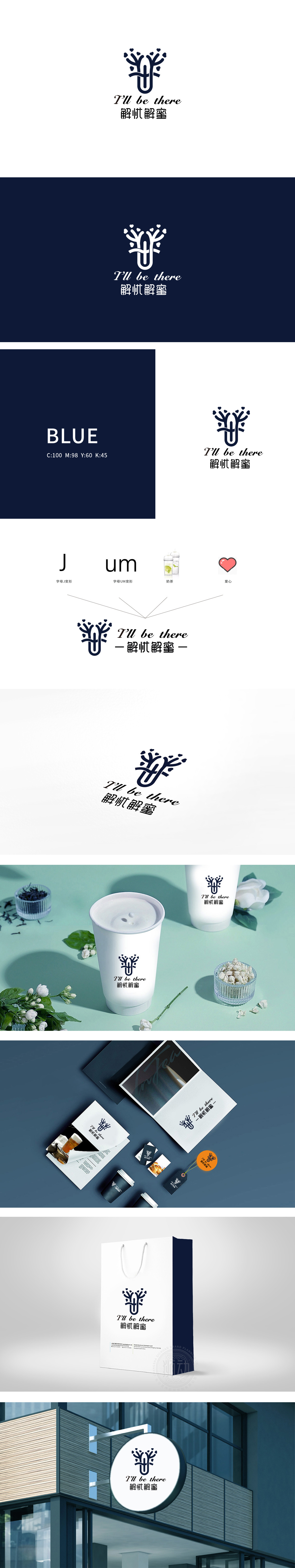
狮动设计采用字母J变形:直接指向品牌核心诉求——“解忧”;同时,“J”的线条流畅,像“展开的怀抱”,传递“成长、陪伴、守护”的感觉,字母UM变形:用拟声词强化产品的味觉体验。融入奶茶杯图形:突出明确产品属性,整体设计用“符号化设计”暗示奶茶的“功能属性”与“情感属性”:完美传递了奶茶品牌“不仅是饮品,更是情绪解药”的核心价值。
Lion design adopts the letter J deformation: it directly points to the brand's core appeal-"solving worries"; At the same time, the lines of "J" are smooth, like "open arms", conveying the feeling of "growth, companionship and protection", and the letter UM is deformed: onomatopoeia is used to enhance the taste experience of products. Incorporating the graphics of milk tea cups: highlighting the product attributes, the overall design implies the "functional attributes" and "emotional attributes" of milk tea with "symbolic design".


扫码或拨打添加客服微信


