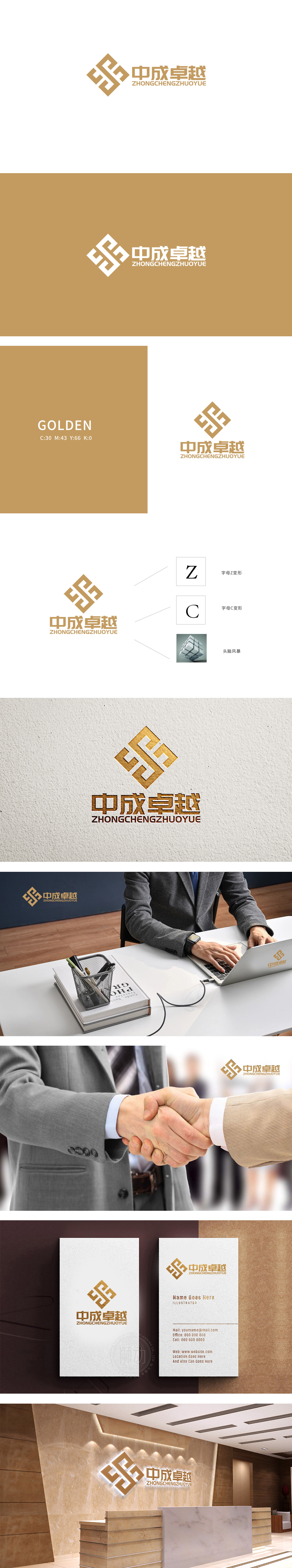
狮动设计以菱形框架为基底,内部通过几何线条的巧妙交织,将品牌名称“中成”的拼音首字母“Z”与“C”进行了一体化设计:菱形的对称结构形成强烈的视觉记忆点,线条的粗细变化增加了层次感,既保留了传统符号的稳重感,又通过几何化处理注入了现代感;魔方作为“头脑风暴”的视觉符号,是整个设计的理念升华——它象征商业咨询的核心价值:通过结构化思维(魔方的立体结构)解决复杂问题(魔方的拆解与重组)。金色调的选择高级,既符合“卓越”的品牌定位(高贵、品质),完美适配商业咨询行业的“专业可信”形象。
Lion Design is based on a rhombic frame, and its internal geometric lines are skillfully interwoven, which integrates the pinyin initials Z and C of the brand name Zhongcheng. The symmetrical structure of the rhombus forms a strong visual memory point, and the thickness change of the lines increases the sense of hierarchy, which not only retains the sense of stability of traditional symbols, but also injects a sense of modernity through geometric processing. As a visual symbol of "brainstorming", Rubik's Cube is the sublimation of the whole design concept-it symbolizes the core value of business consulting.


扫码或拨打添加客服微信


