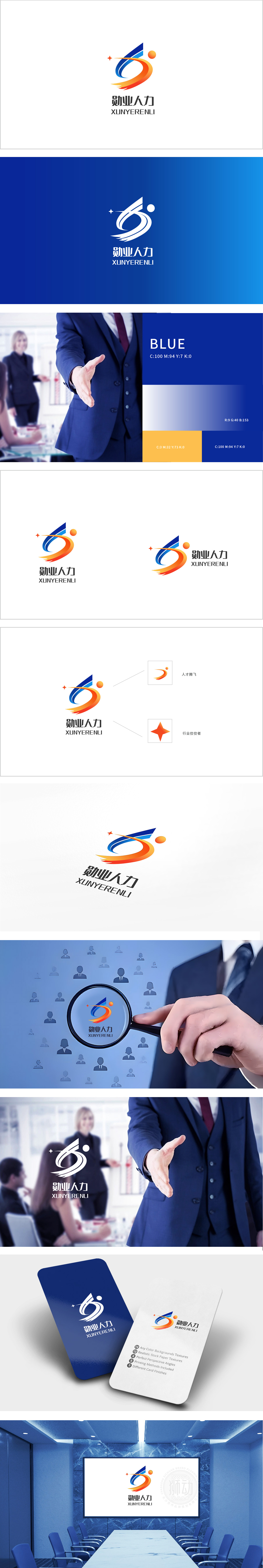
狮动设计以蓝橙渐变曲线、橙色圆点、小五角星三大元素构成,整体呈现“上升-流动”的视觉动势,直接呼应人力资源“推动成长”的核心使命:曲线形态:蓝与橙的渐变曲线相互缠绕,曲线的流动感则隐喻“人才与企业的连接”**——人力资源作为桥梁,推动两者共同成长。橙色圆点:强化“以人为本”的行业属性。小五角星:暗示企业对“人才质量”的追求。整体通过抽象化的曲线、有温度的色彩,将“人才发展”“专业服务”“行业领先”等核心价值转化为可感知的视觉语言—用视觉符号讲好“人力资源的故事”。
Lion Design is composed of three elements: blue-orange gradient curve, orange dot and small pentagram, showing the visual dynamic trend of "rising-flowing" as a whole, directly echoing the core mission of "promoting growth" of human resources: the curve shape: the gradient curves of blue and orange are intertwined, and the fluidity of the curve is a metaphor for "the connection between talents and enterprises" * *-human resources serve as a bridge to promote their common growth. Orange dot: strengthening the industry attribute of "people-oriented" Small five-pointed star: it implies the pursuit of "talent quality" by enterprises. Through the abstract curve and temperature color, the core values such as "talent development".


扫码或拨打添加客服微信


