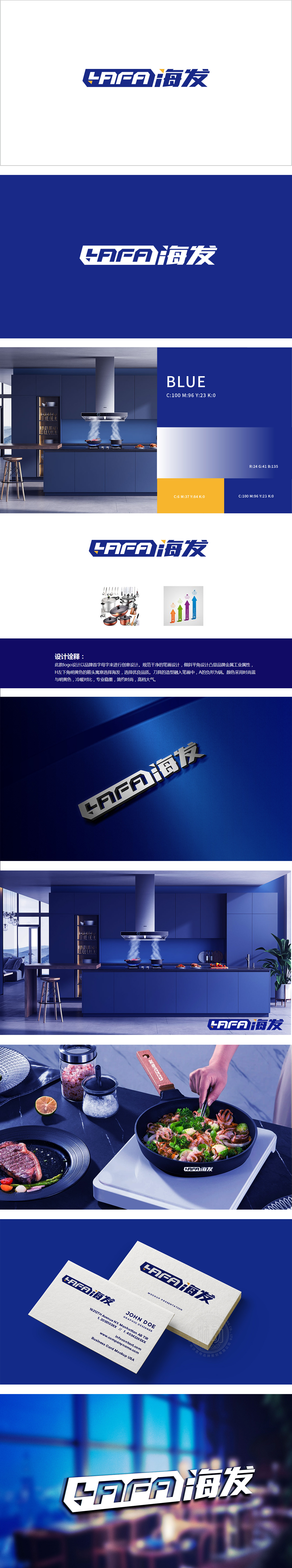
狮动设计以品牌首字母**“HAFA”*为基底,将厨具的核心元素“刀具”“锅具”*巧妙融入笔画:采用金属工业感的倾斜平角,搭配明黄色的小箭头,既模拟了刀具的锋利造型,又通过“箭头”隐喻“选择海发、选择优质”的品牌主张;“A”的负形创意为锅的形态,直接点出品牌的核心品类——厨具,时尚蓝(主色)与明黄(点缀色)的冷暖对比,体现“活力、时尚”,整体以核心视觉符号到产品图形呈现,每一处都紧扣“厨具品牌”的属性,用创意将“功能”与“美学”完美融合,既传递了品牌价值,又让人感受到设计的巧思。
Lion design is based on the brand initials "Hafa" , and the core elements of kitchenware "knife" and "pot" * are ingeniously integrated into the strokes: the inclined straight angle with a sense of metal industry is adopted, and the bright yellow arrow is matched, which not only simulates the sharp shape of the knife, but also implies the brand proposition of "choosing Haifa and choosing high quality" through the arrow; The negative creativity of "A" is in the form of a pot, which directly points out the core category of the brand-kitchen utensils, and the contrast between the cold and warm of fashion blue (main color) and bright yellow (dotted color) reflects "vitality and fashion".


扫码或拨打添加客服微信


