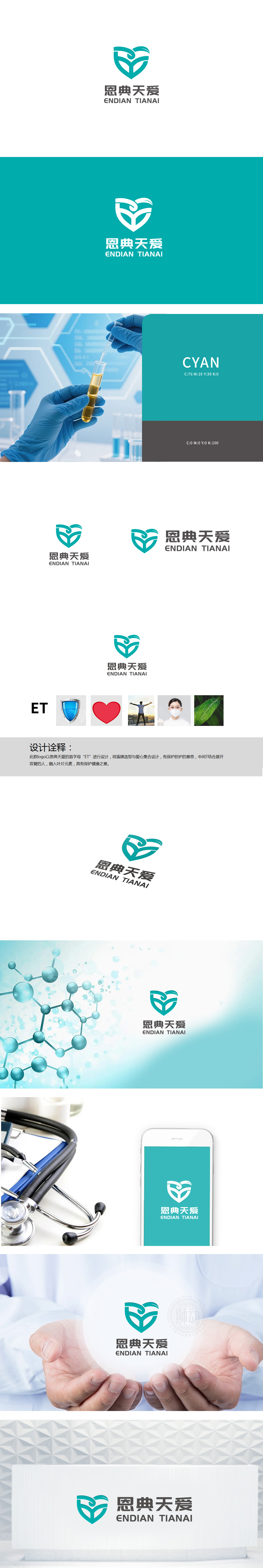
狮动设计以品牌首字母“ET”为创意原点,将盾牌(保护)、爱心(关爱)、人形(健康)、叶片(自然)四大元素有机融合,形成了极具记忆点的视觉符号:盾牌+爱心的叠加:盾牌的金属质感自带“防护”属性,对应医疗服务中“安全第一”的底层需求),爱心的曲线则柔化了盾牌的生硬,传递出“医疗不仅是治病,更是对人的关怀”这一核心温度,“T”字母的创意转化:既象征着“健康”,又融入了“自然”,暗示医疗服务的延伸,整体采用蓝绿色调(冷静、专业)与爱心的红色(温暖、热情)互补,既体现了医疗的“专业性”,,完美平衡了“专业”与“亲民”,将医疗服务的“核心价值”(保护、关爱、健康、专业、自然)与“品牌理念”(恩典天爱)完美融合。
Lion Design takes the brand initials "ET" as the creative origin, and organically integrates the four elements of shield (protection), love (care), human form (health) and leaf (nature), forming a visual symbol with great memory: the superposition of shield+love: the metal texture of shield has its own "protection" attribute, which corresponds to the bottom demand of "safety first" in medical services) and love. It is the core temperature of caring for people, and the creative transformation of the letter "T" not only symbolizes "health", but also incorporates "nature", suggesting the extension of medical services.


扫码或拨打添加客服微信


