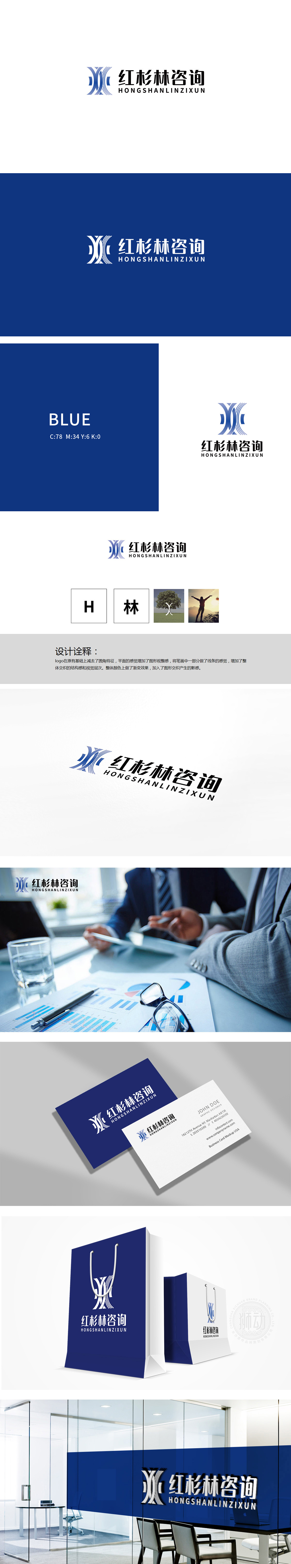
狮动设计以品牌名称首字母“H”为核心形态,与“林”作为品牌核心词,通过logo中“线条交织”的视觉语言模拟“树木枝叶交错”的自然形态,将抽象的“林”转化为具体的图形记忆点,又传递了“成长、稳定、生命力”的咨询服务内核,通过“logo的线条”“树的意象”“人的剪影”就能快速理解“红杉林咨询是做什么的”(陪伴客户像红杉林一样成长),实现“视觉-理念”的直接共鸣。
Lion Design takes the initial "H" of the brand name as the core form, and "Lin" as the core word of the brand. It simulates the natural form of "trees with intertwined branches and leaves" through the visual language of "lines" in logo, transforms the abstract "Lin" into concrete graphic memory points, and conveys the core of consulting service of "growth, stability and vitality", and through the image of "lines" and "trees" in logo.


扫码或拨打添加客服微信


