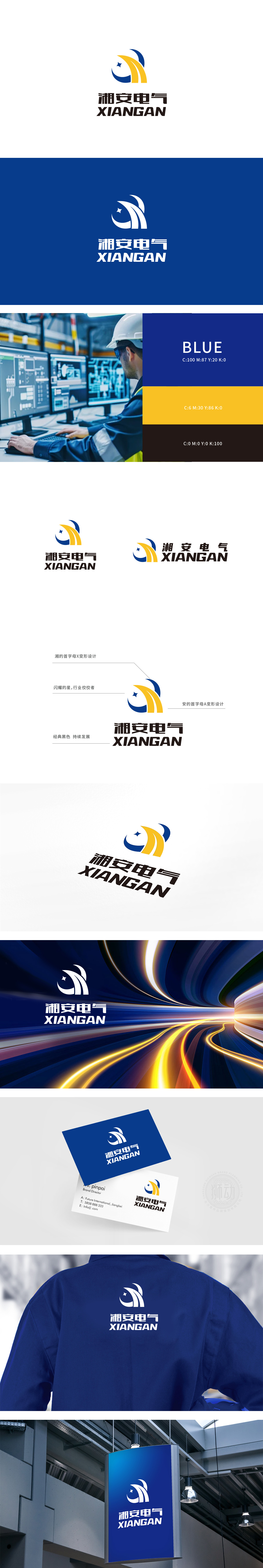
狮动设计将抽象概念转化为可感知的图形:(X)与“(A)的变形设计:突出品牌名,黄色阶梯不仅传递“拼搏进取”的企业精神,更暗示品牌在电气技术上的“向上突破”,符合客户对“技术可靠、不断进步”的期待。黑色作为“经典、永恒、稳定”的代表,与“持续发展”的品牌理念呼应,平衡了蓝色与黄色的跳跃感,让整体视觉显得“稳重而不沉闷,活力而不浮躁”。星星的“小而亮”,如同电气产品中的“核心部件”,传递品牌在细分领域的“专业深耕”,同时为整体偏稳重的logo增添了一丝“未来感”。
Lion design transforms abstract concepts into sensible graphics: (x) and (a) variant design: highlighting the brand name, the yellow ladder not only conveys the enterprise spirit of "striving for progress", but also implies the brand's "upward breakthrough" in electrical technology, which meets the customer's expectation of "reliable technology and continuous progress". As a representative of "classic, eternal and stable", black echoes the brand concept of "sustainable development", balances the jumping sense of blue and yellow, and makes the overall vision appear "steady but not dull, energetic but not impetuous".


扫码或拨打添加客服微信


