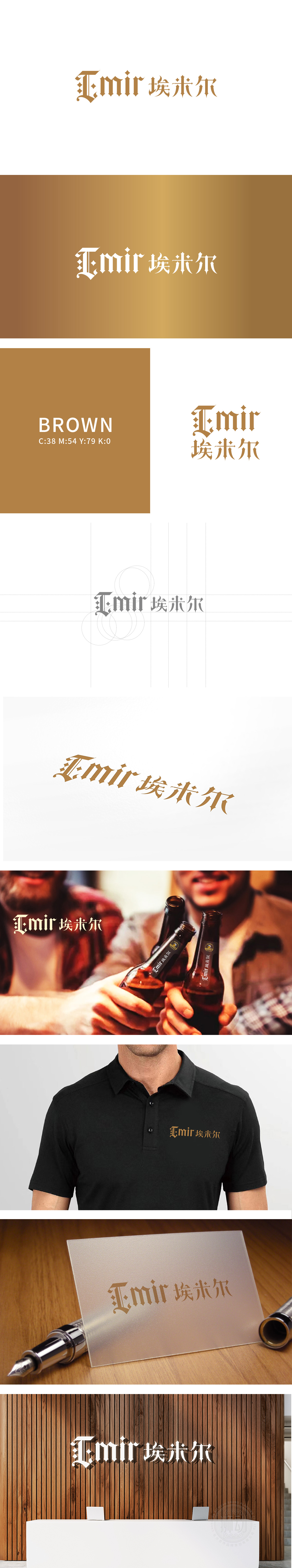
狮动设计采用是带装饰性的 serif 风格,字体本身就有“传统工艺”“考究细节”的联想——像精酿啤酒强调的“手工酿造”“慢工艺”,刚好通过字体的“精致感”传递出来。再加上鎏金色的配色,既符合“高端啤酒”的质感,又自带一种“异域贵族”的氛围感,瞬间把品牌和“普通工业啤酒”区分开,暗示这是一款“有故事、有品质的精酿”。整体用“字体的工艺感”“颜色的质感”“名字的故事性”,把“高端啤酒”的核心卖点(品质、仪式感、独特性)藏在每一个设计细节里。
Lion design adopts decorative serif style, and the font itself has the association of "traditional craftsmanship" and "exquisite details"-like the "manual brewing" and "slow craftsmanship" emphasized by craft beer, which is just conveyed through the "exquisite feeling" of the font. Coupled with the gold-plated color scheme, it not only conforms to the texture of "high-end beer", but also has an atmosphere of "exotic aristocrats", which instantly distinguishes the brand from "ordinary industrial beer", suggesting that this is a "story-telling and quality craft".


扫码或拨打添加客服微信


