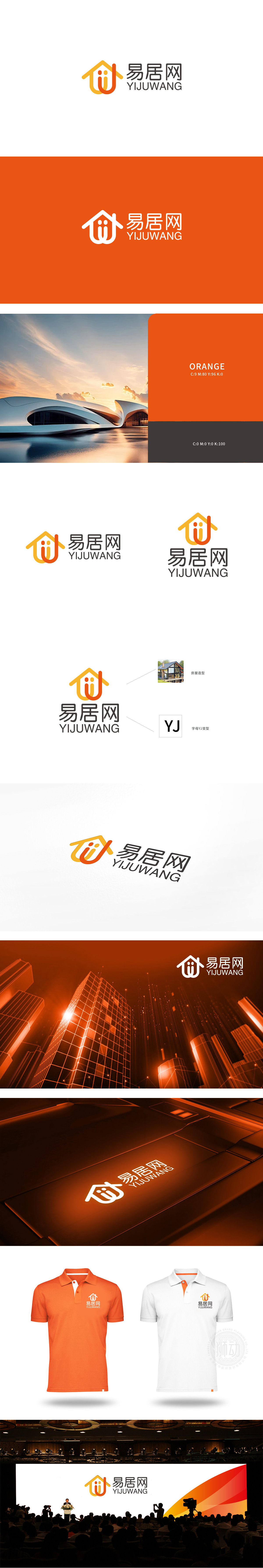
狮动设计以YJ变型——品牌缩写的视觉化,用“房屋造型”告诉用户“我们是做居住服务的,房屋造型里面有两个橙色的小圆点,像“两个人站在房子里”。这个细节很有“情感共鸣”——它暗示“易居网连接的是‘人’与‘居住’”,而不是冷冰冰的房源信息。暖色调传递“温度感”,所有元素都在同步传递一个信号:“我是帮你找家、布置家的平台,我懂你的需求。“真正把“视觉设计”变成了“品牌沟通的工具”!
Lion design uses YJ variant-visualization of brand abbreviation, and tells users that "we are engaged in residential service" with "house modeling". There are two orange dots in the house modeling, like "two people standing in the house". This detail is very "emotional"-it implies that "E-home network connects" people "and" residence ",rather than cold listing information. Warm colors convey a "sense of temperature", and all elements simultaneously convey.


扫码或拨打添加客服微信


