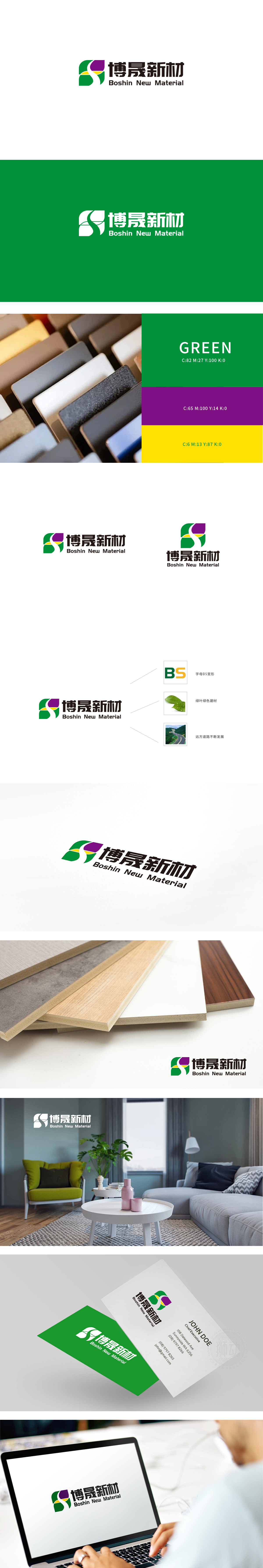
狮动设计采用“BS”变形设计(绿色+黄色)既是“博晟”(Boshin)的首字母缩写,也通过色彩与形态传递出建材企业的核心属性:绿色作为主色调,直接关联“建材”的“环保”内核,符合当下消费者对“可持续性”的需求;黄色的点缀则注入了“活力”与“创新”,打破传统建材企业的沉闷感,暗示品牌在技术或产品上的突破;抽象的字母形态既保留了品牌的识别性,又通过现代感的设计语言传递出“建材企业的年轻化与国际化”。把建材企业的“硬核”属性,变成了消费者能看懂、能记住、能产生共鸣的“软符号”。
Lion Design adopts the variant design of "BS" (green+yellow), which is not only the acronym of "Boshin", but also conveys the core attributes of building materials enterprises through color and form: green, as the main color, is directly related to the "environmental protection" core of "building materials", which meets the current consumer demand for "sustainability"; The yellow embellishment injects "vitality" and "innovation", breaking the dull feeling of traditional building materials enterprises and suggesting the breakthrough of brands in technology or products; The abstract letter form not only retains the brand recognition.


扫码或拨打添加客服微信


