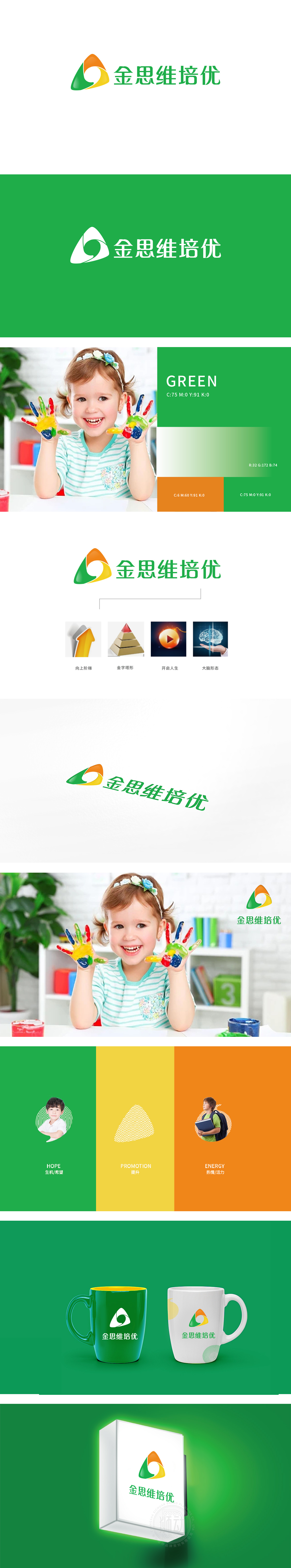
狮动设计用形状与色彩写活“思维”的本质,主LOGO的核心是“三角形+圆”的抽象组合,橙、绿、黄三色渐变:橙色像火焰,代表学习的活力与热情;绿色是成长的颜色,对应思维的萌芽与进步;黄色像阳光,象征智慧的光芒——三种颜色叠加,刚好契合“图形分析教育”中“从兴趣激发(橙)到能力成长(绿)再到智慧提升(黄)”的培养路径。三角形本身是最稳定的形状,寓意“思维的结构化”,圆代表“灵动”,创新。整体LOGO把思维培养、结构化、循序渐进、应用导向)都藏在了图形里,培养“会思考的大脑”,“激活认知”。
Lion design uses shapes and colors to describe the essence of "thinking". The core of the main LOGO is the abstract combination of "triangle+circle", and the colors of orange, green and Huang San gradually change: orange is like a flame, representing the vitality and enthusiasm of learning; Green is the color of growth, corresponding to the germination and progress of thinking; Yellow is like sunshine, symbolizing the light of wisdom-the superposition of three colors just fits the training path of "from interest stimulation (orange) to ability growth (green) to wisdom improvement (yellow)" in "graphic analysis education".


扫码或拨打添加客服微信


