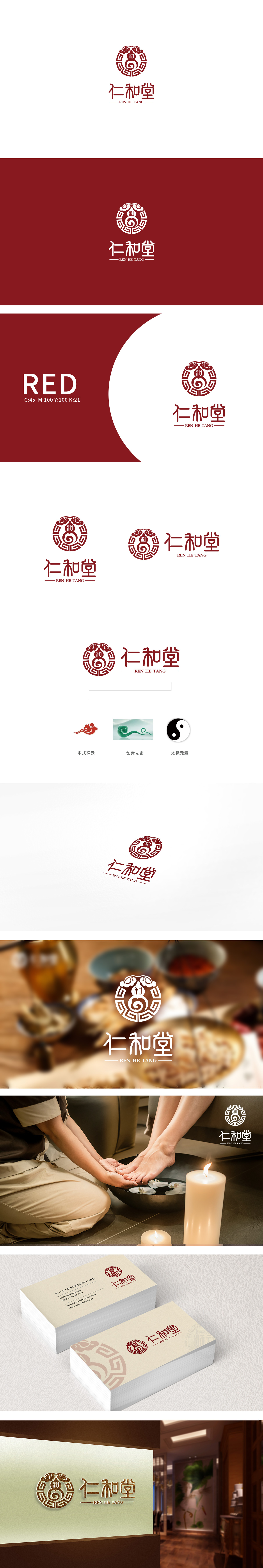
狮动设计采用葫芦-中医的经典符号(“悬壶济世”的典故),代表医药、救疗,是中医“医乃仁术”的具象化;品牌名“仁和堂”的核心(“仁”是医德,“和”是医理),更传递了中医的核心哲学——“调和阴阳”“和而不同”。 回纹是中国传统纹样,象征“绵延不断”“生生不息”,整体设计用现代设计语言“翻译”了中医文化的核心,又通过简化、对称、和谐的设计手法,精准传递品牌基因。
Lion design adopts gourd, a classic symbol of Chinese medicine (the allusion of "saving the world by hanging a pot"), which represents medicine and salvation, and is the embodiment of "medicine is benevolence" in Chinese medicine; The core of the brand name "Renhetang" (benevolence is medical ethics and harmony is medical theory) also conveys the core philosophy of traditional Chinese medicine-"harmony between yin and yang" and "harmony without difference". Palindrome is a traditional pattern in China, symbolizing "continuity" and "endless life".


扫码或拨打添加客服微信


