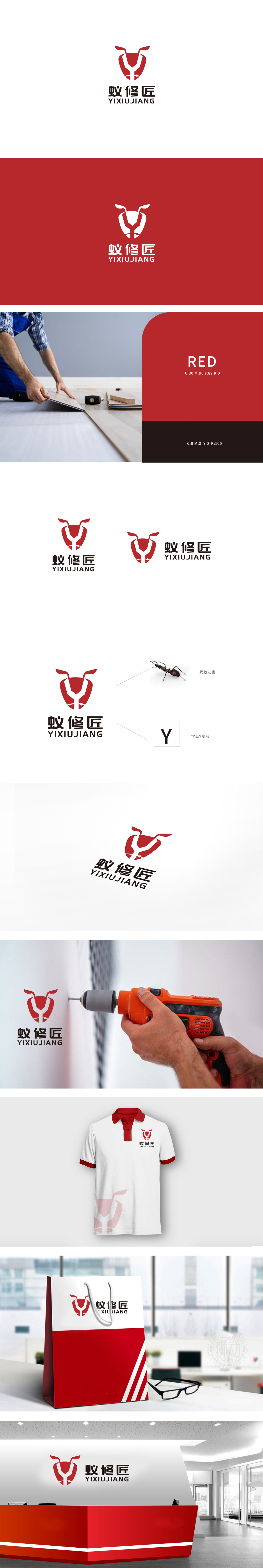
狮动设计采用符号化的"行业属性+品牌个性",蚁":通过触角元素视觉化,传递"勤奋、细致";"修":通过Y形工具、裂纹元素,强化"维修、修复"的动作;"匠":盾形的"厚重感"与整体的"简洁设计",共同塑造"专业工匠"的形象。LOGO 主体是一个红色盾形,盾牌是"可靠、安全"的经典符号,直接对应维修服务的"信任需求"——让用户觉得"交给他们很放心"。整体通过蚂蚁的"勤奋、细致、团队协作"特性,完美传递了维修工匠"认真负责、细节到位"的职业形象。
Lion design adopts symbolic "industry attribute+brand personality" and "ant": through the visualization of antenna elements, it conveys "diligence and meticulousness"; Repair ":strengthen the action of" maintenance and repair "through Y-shaped tools and crack elements;" Craftsman: The shield-shaped "heavy feeling" and the overall "simple design" jointly create the image of "professional craftsman". The main body of LOGO is a red shield, and the shield is a classic symbol of "reliability and safety", which directly corresponds to the "trust demand" of maintenance service-making users feel "they are at ease".


扫码或拨打添加客服微信


