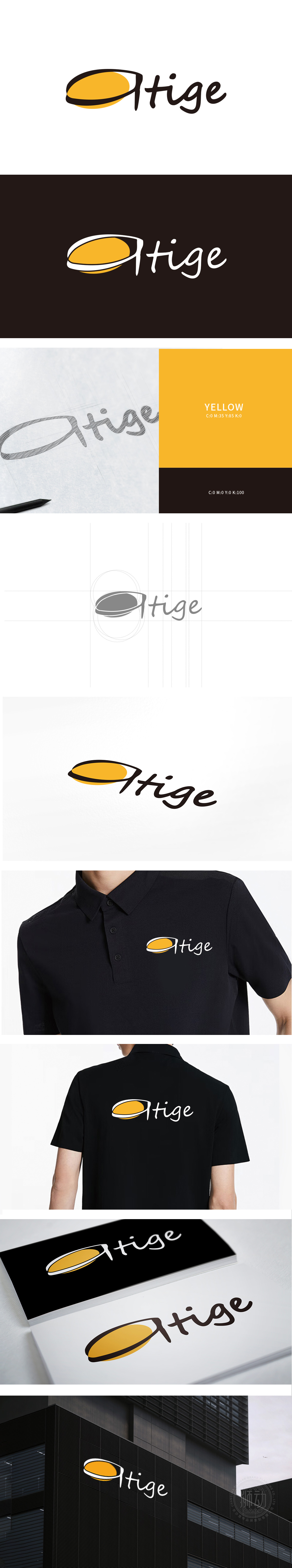
狮动设计采用无棱角的圆润设计,每一笔画都有明显的曲线弧度:“i”的点用圆形代替,呼应图形的圆弧轮廓;“g”的尾部以流畅的曲线收尾,增加字体的“动势”;“e”的开口处用半圆曲线处理, 字型的圆润曲线与手写质感传递出“年轻、活泼”的气息,手写体的个性质感能让消费者感受到“突破自我的独特性,整体字体,传递出柔和、亲切的视觉感受,但曲线的流动感又保留了活力与灵动。
Lion design adopts rounded design without edges and corners, and each stroke has obvious curve radian:The point of "I" is replaced by a circle, which echoes the arc outline of the figure; The tail of the "G" ends with a smooth curve to increase the "dynamic potential" of the font; The opening of the "E" is treated with a semicircle curve. The rounded curve of the font and the handwriting texture convey a youthful and lively atmosphere.


扫码或拨打添加客服微信


