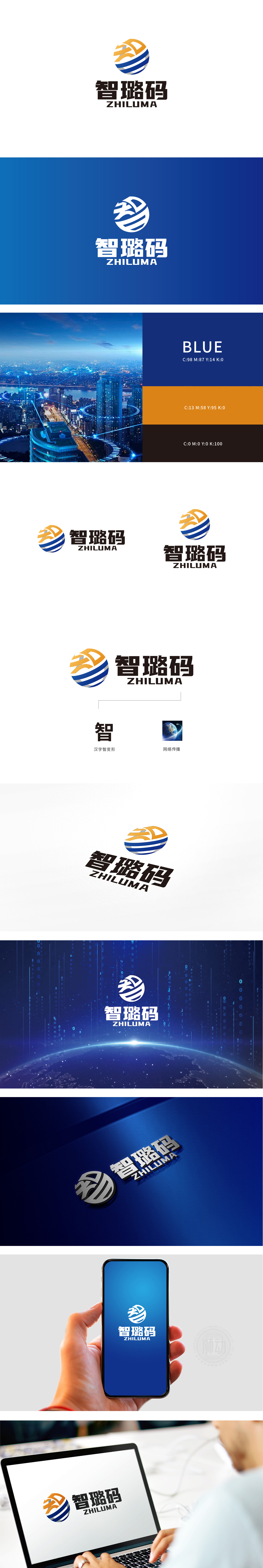
狮动设计通过几何简化与颜色分区,同时承载了“智”与“路”两大核心概念:“路”的具象化:蓝白相间的水平条纹,明显模拟了“道路”或“路径”的形态,直接对应品牌名中的“路”,传递“传播路径”“发展路径”的含义;“智”的抽象化:“智”字的极简变形,既强化了“智慧”的核心概念,又通过箭头的“向上趋势”传递“创新、前进”的品牌调性;圆形基底的隐喻:圆形本身具有“完整、循环、全球”的属性,呼应“网络传播”的全域性,同时让图形更具包容感。整体用极简语言串联“智慧-路径-传播”的品牌逻辑。
Lion Design carries two core concepts of "wisdom" and "road" through geometric simplification and color division: the concretization of "road": blue and white horizontal stripes obviously simulate the shape of "road" or "path", which directly corresponds to the "road" in the brand name and conveys the meaning of "propagation path" and "development path"; The abstraction of "wisdom": the minimalist deformation of the word "wisdom" not only strengthens the core concept of "wisdom", but also conveys the brand tonality of "innovation and progress" through .


扫码或拨打添加客服微信


