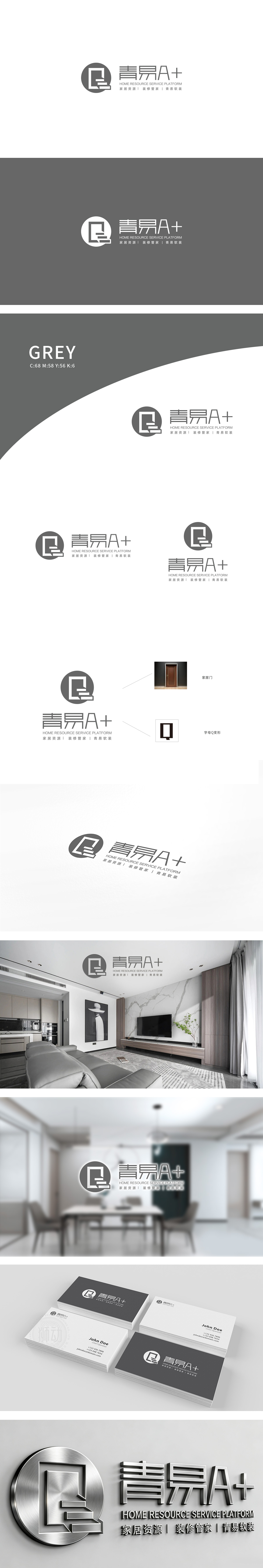
狮动设计用「家的记忆」建立情感连接,「青」:取「清新、自然」之意,同时暗示「年轻态」;「易」:直接点出「便捷性」;「A+」:用符号强化「品质感」;圆形图标是整个设计的「视觉锚点」,看似简单的线条,其实藏着「家居场景的隐喻」:图标内的「阶梯+门」组合:门是「家」的核心符号(象征入口、归属感),阶梯则是「生活升级」的隐喻。两者结合,相当于用视觉语言说:「这里是你实现「理想家」的起点」。把「商业诉求」藏在「生活场景」里——用户看到这个logo,会联想到「自己未来的家」。这种「视觉与情感的共鸣」,正是家居装饰设计最核心的「用户思维」。
Lion design to establish emotional connection with "the memory of home". "Qing" means "fresh and natural" and implies "youthful state". "Easy": directly point out "convenience";"A+": use symbols to strengthen the "sense of quality"; The circular icon is the "visual anchor" of the whole design, and the seemingly simple line actually hides the "metaphor of home scene":The combination of "staircase+door" in the icon: the door is the core symbol of "home" (symbolizing entrance and sense of belonging), and the staircase is the metaphor of "life upgrade". The combination of the two is equivalent to saying in visual language: "This is the starting point for you to realize your" ideal home .
.


扫码或拨打添加客服微信


