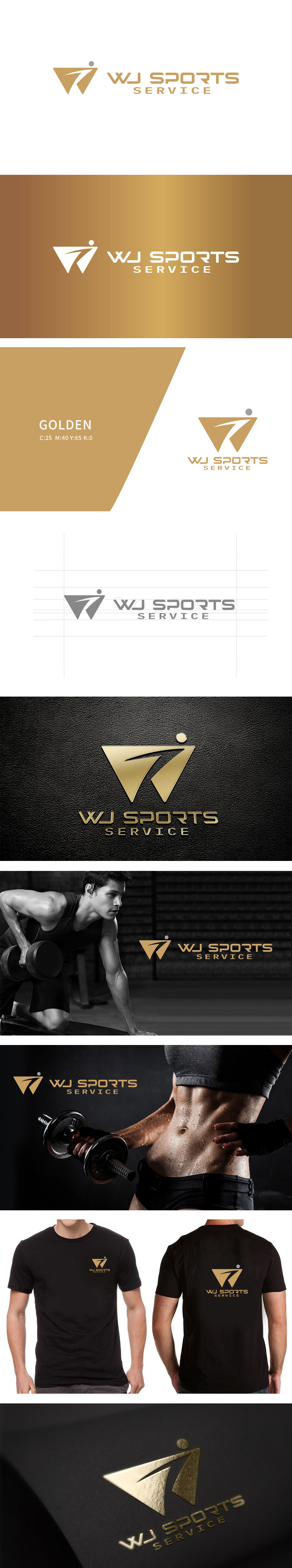
狮动设计用几何语言传递运动的“力量感”与“前进性”,用极简的几何元素组合出了强烈的运动意象:三角形基底:三角形是最具“稳定性”与“力量感”的几何形状,同时尖锐的顶角向上延伸,又带有“突破”的动态感——像运动员发力时的肌肉线条,或冲刺时的身体姿态,直接关联健身中“力量训练”“突破自我”的核心需求。箭头是“方向”与“前进”的符号,传递“不断进步”的积极信号。箭头上方的灰色小圆点,用微小的细节强化了“专注”与“目标感”。整体把运动服务的核心特质融入了图形与字型的细节里,既符合健身/运动行业的属性,又传递出专业、活力与进取的品牌形象。
Lion design uses geometric language to convey the sense of strength and progressiveness of the movement, and combines strong sports images with minimalist geometric elements: the triangle base: the triangle is the geometric shape with the most sense of stability and strength, while the sharp vertex angle extends upward, with a sense of dynamic breakthrough-like the muscle lines of athletes when they exert their strength or the body posture when they sprint, which is directly related to fitness. Arrows are symbols of "direction" and "progress".


扫码或拨打添加客服微信


